
Portfolio — Jay Lee39.7392° N / 104.9903° W — Denver, CO

Hi, I’m Jay.

Product designer in Denver, at Deloitte Digital — turning messy problems into interfaces people love.

Denver, CO Deloitte Digital Product Design

Product Design+Visual Design+UX Design+UI Design+Prototyping+Typography+Design Systems+Interaction Design+Branding Identity
Work
Index — 10 ProjectsClient · Role · Year
Digital Retention Experience

Digital Retention Experience

A digital retention experience for a telecom company — redesigning the journey for customers looking to cancel their internet or TV service.

Telecom · Product Designer · 2025

Design System Governance

Design System Governance

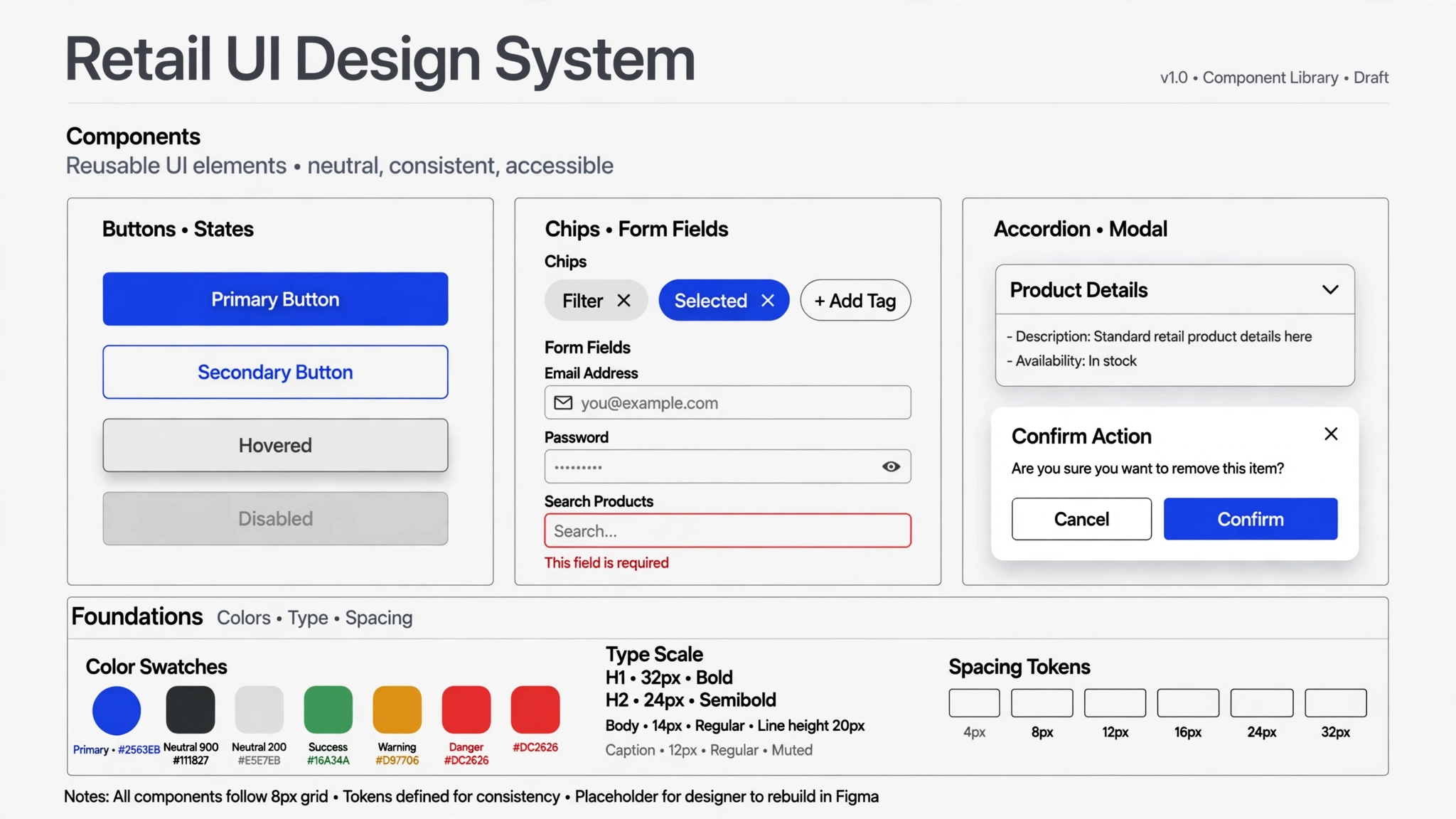
A consulting engagement to build up a national retail brand’s design system and design governance.

National Retail · Design Consultant · 2026

Health App Redesign

Health App Redesign

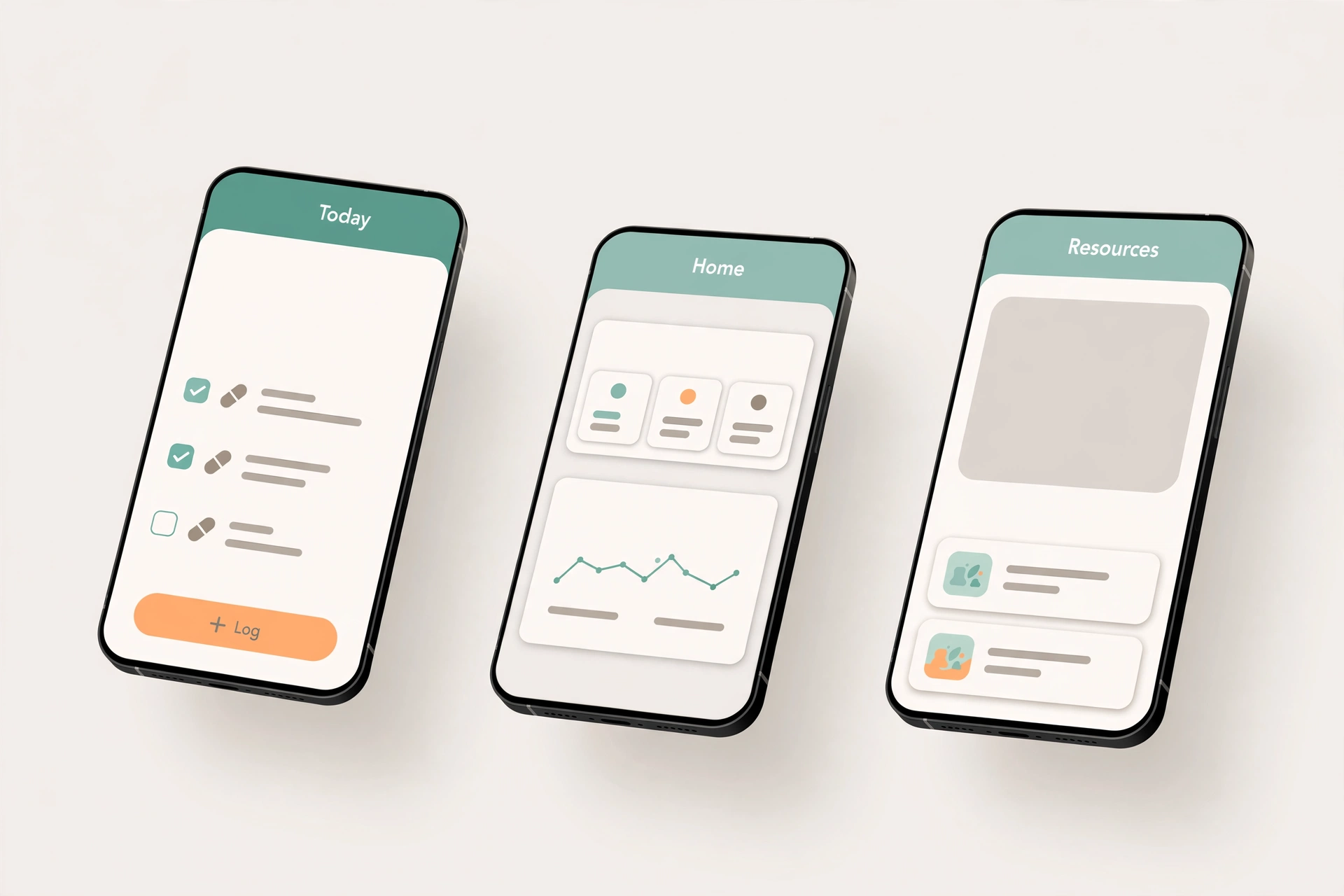
A redesign of a health app from a pharmaceutical company — used by patients to log their medication usage and find health information.

Pharmaceutical · Senior UI Designer · 2025

Hotel Website Brand Pull-Through

Hotel Website Brand Pull-Through

A global hospitality company operates a large portfolio of distinct hotel brands — but their websites all looked and felt the same.

Global Hospitality · Senior UI Designer · 2021

Insight App

Insight App

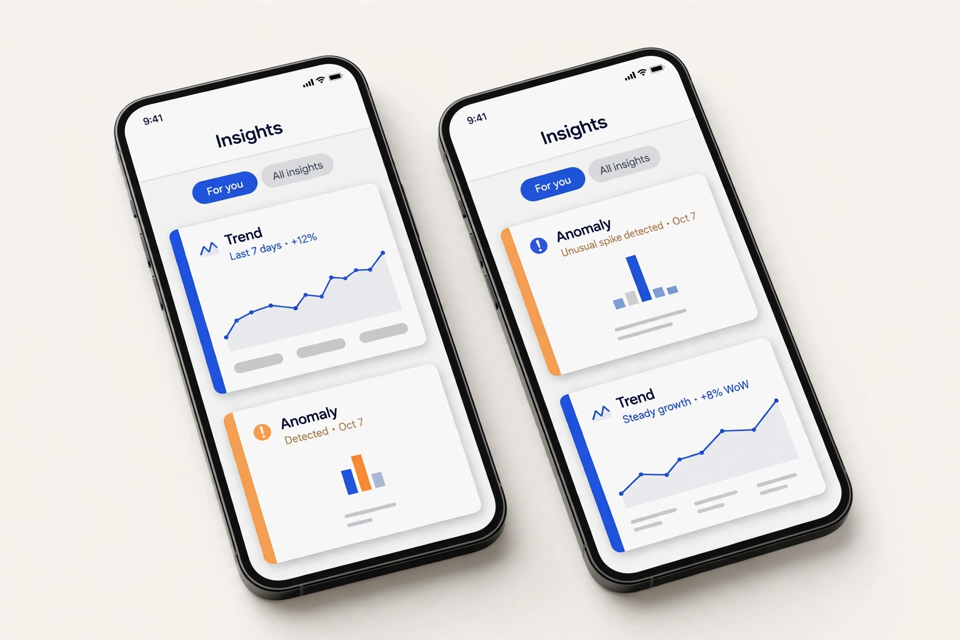
Insight is an internal iOS app for a global technology company. Data scientists publish findings to the app; company leadership reads them and acts quickly.

Global Technology · UI Designer · 2019–2020

myColorado

myColorado

As the State of Colorado's official mobile app, myColorado provides a simple, secure and convenient way to access state services right from the palm of your hand.

Mobile App · Lead UX/UI Designer

See Mama Bee

See Mama Bee

Lifestyle app for the modern mama. Features include tracking their lifestyle choices and the allergies of their minis through a fun, playful interface.

Mobile App · Interface Design

EnVision

EnVision

A guided visualization app designed to help you overcome what holds you back from living your best life.

Mobile App · UX/UI & Branding

Firepoint

Firepoint

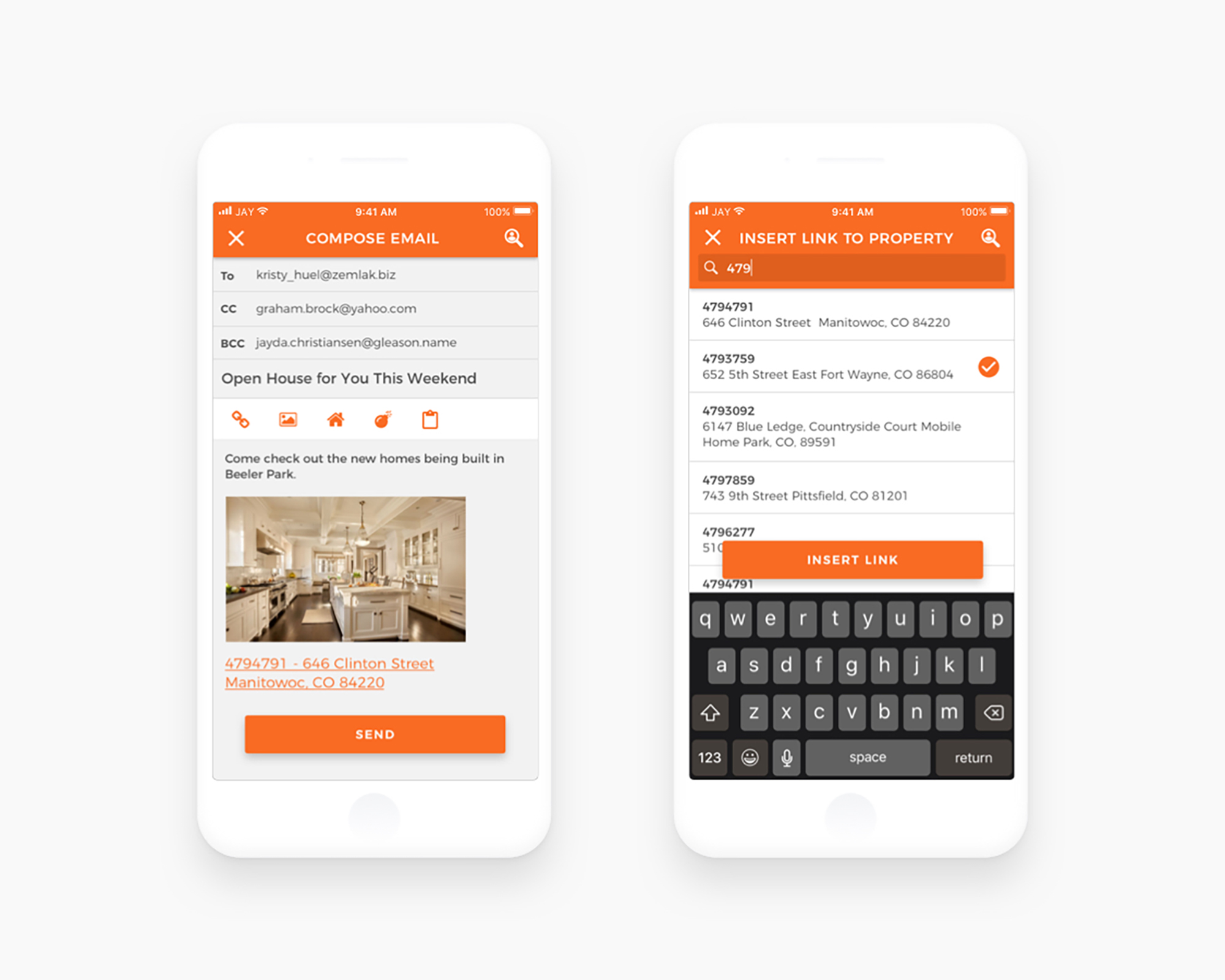
A customer-relationship management software specifically for a real estate agents.

Mobile App · iOS & Android Design

Helping Habit

Helping Habit

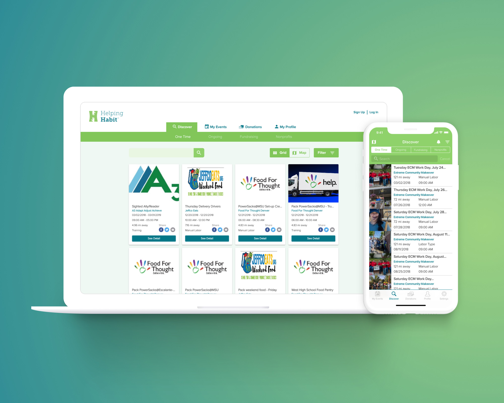
Helping Habit aims to be a bridge between volunteers and nonprofits.

Nonprofit · iOS & Web App

About
Jay Lee

I’m a product designer. What I love about my job is solving various problems every day for many different fields, and I’m a prototyping nerd, I’m obsessed with trying and learning all the new tools, plugins, and services out there.

Outside of the office, I try to spend time with my kids as much as I can. I love photography with my vintage-looking camera Nikon Df. And, as a former breakdancing daddy, I love to go to the dance studio with my son Jackson, I used to be a decent dancer, but now I’m like “hold my beer and watch this”.

If you want to work with me or just want to chat, please don’t hesitate to reach out to me. ☕️

Thanks!

← Work

Digital Retention Experience

A digital retention experience for a telecom company — redesigning the journey for customers looking to cancel their internet or TV service. The goal: respect the user’s intent to leave, while giving the business a fair chance to retain them.
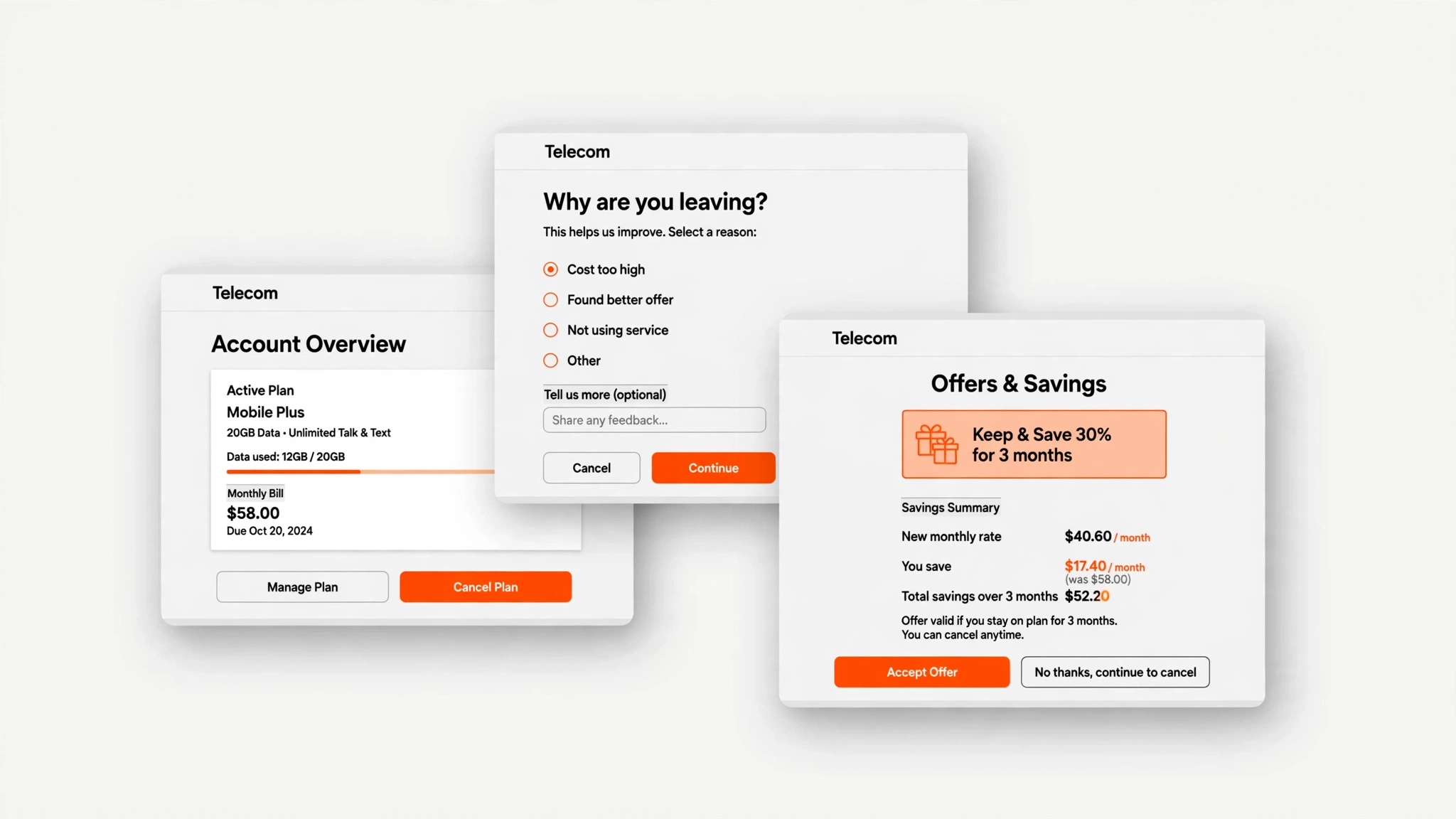
Digital Retention Experience

Client

Telecom company · Client confidential

Role

Product Designer, 2025 (approx. 6 months)

Team

PM and two designers (including me).

Context

Customers who wanted to stop their internet or TV service faced a poor exit experience — and the business had no structured way to present alternatives before they left.

The project existed because of regulatory pressure: click-to-cancel rules in the U.S. pushed subscription businesses to let customers cancel online as easily as they signed up. The classic offender was the gym membership — trivial to join, painful to leave. The client needed a digital exit that complied.
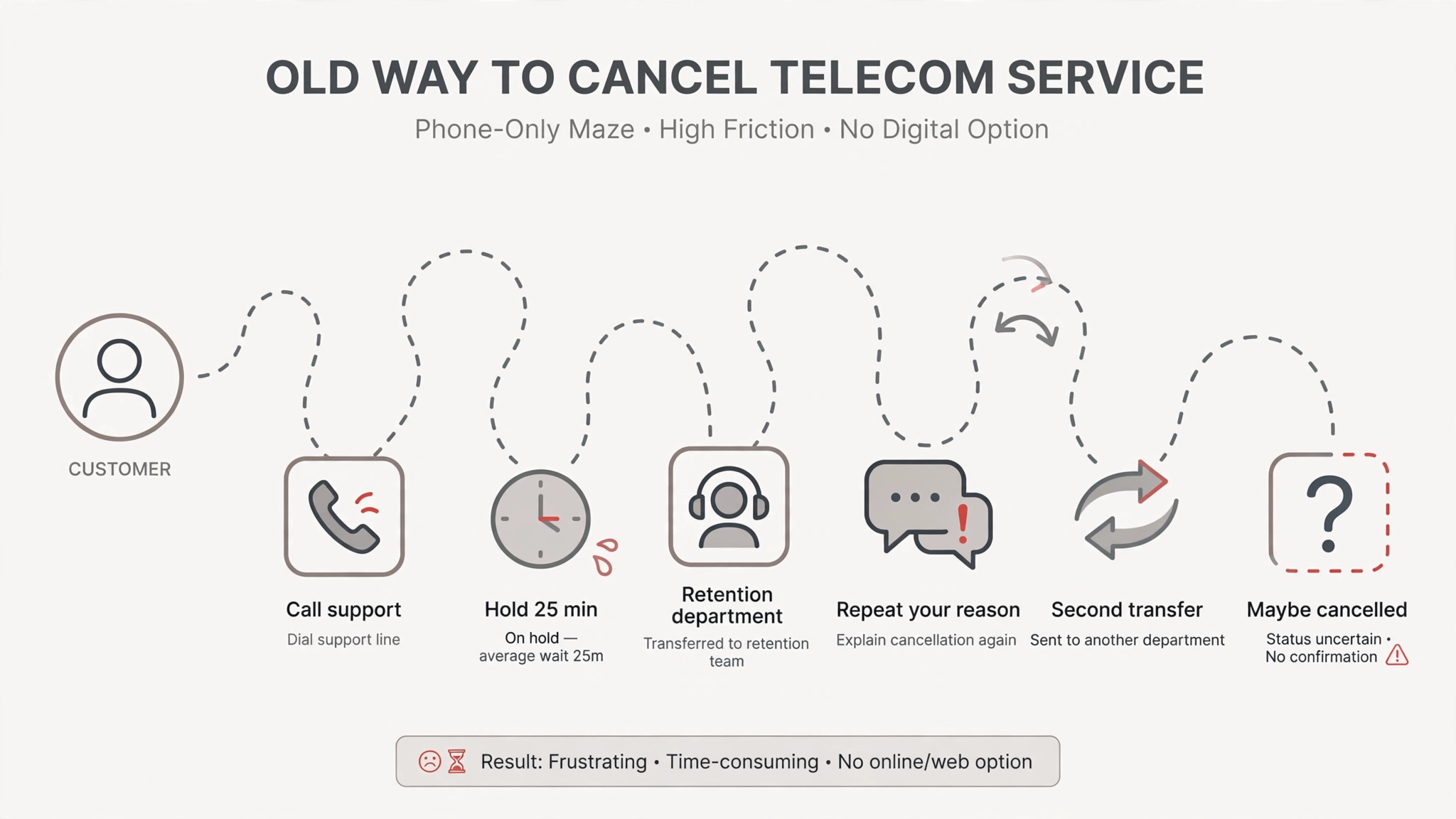
The old phone-only cancellation maze
Before: cancelling meant a phone-only maze. Recreated visual — client work anonymized for confidentiality.

My role

The work split by fidelity. The other designer worked fully in UX — research and low-fidelity wireframes — while I owned the UI side, touching UX lightly: I took the wireframes to high fidelity, applied the brand and the design system, and handled the fine-tuning — consistency across screens, button placement, and interaction details. Requirements came through our PM, a consultant who gathered what the client needed; the design team analyzed the problems and solved them in design. We also presented directly to the client — the main stakeholder was a senior lead on the client’s product team.

The design

1. Start from the call-center playbook.

On the phone, retention agents ask why you’re leaving and make save offers. We translated that human process into a self-serve digital flow: account, intent, offers, exit.
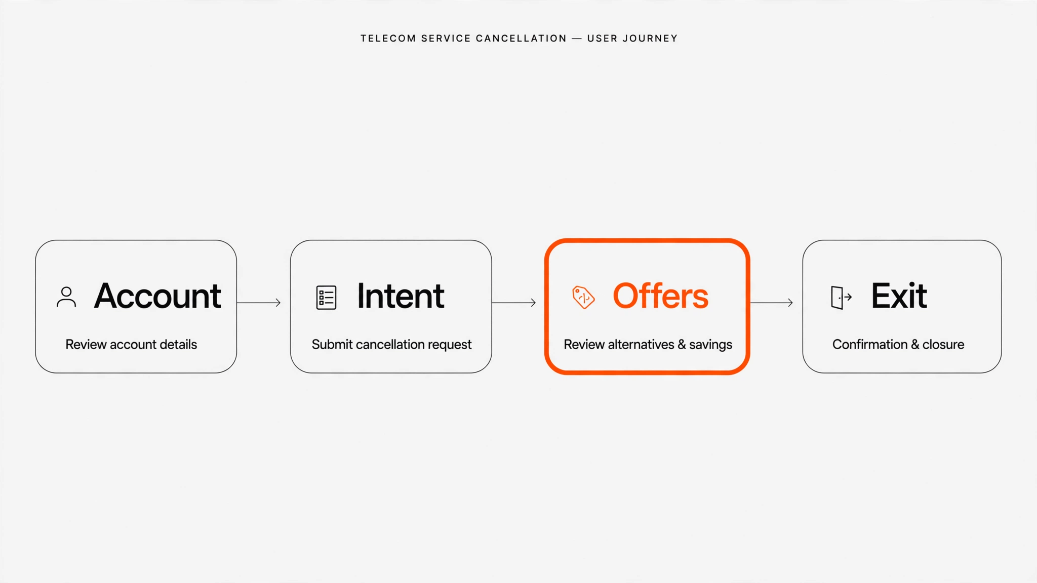
Cancellation journey: Account, Intent, Offers, Exit
The journey, mapped end to end. Recreated visual — client work anonymized for confidentiality.

2. Make exiting easy — start from the user’s intent.

I improved the experience for users who want to stop their services, making it genuinely easy to exit. A one-click exit would be the purest UX — but it would bleed customers, so the exit stays reachable rather than instant. The tradeoff: what’s good for users isn’t automatically good for the business.
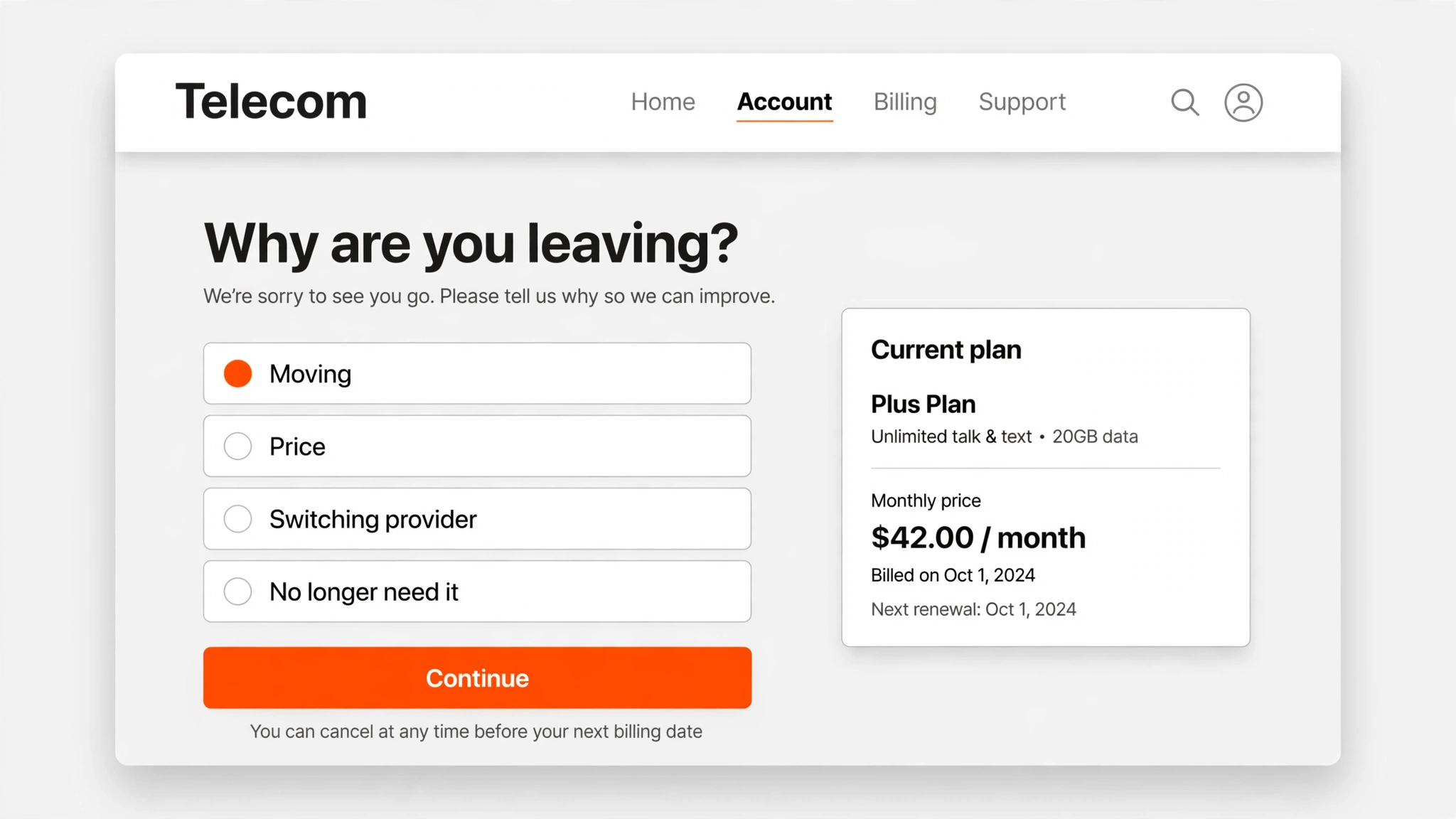
The intent step: why are you leaving?
The intent step — the customer’s current plan and price stay visible throughout. Recreated visual — client work anonymized for confidentiality.

3. Earn the save: upsells, promotions, and clear calculations before exit.

To balance the business side, we added upsells and promotions into the flow — showing customers what they have and what they pay, then new offers with clear calculations of what they’d save or gain — before they complete the exit.
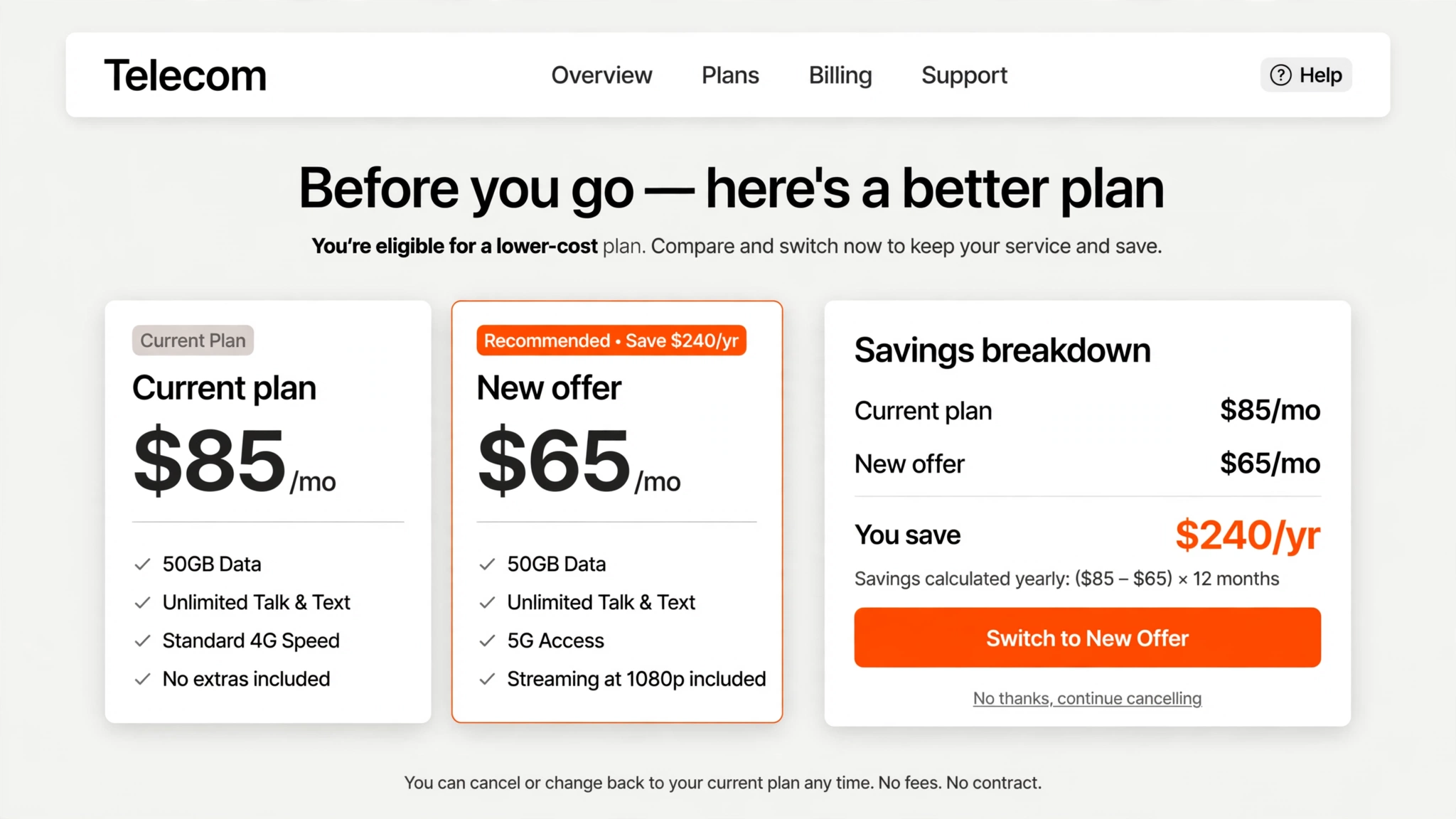
The offers step with a clear savings calculation
The offers step, with the savings math shown plainly — and the exit still one click away. Recreated visual — client work anonymized for confidentiality.
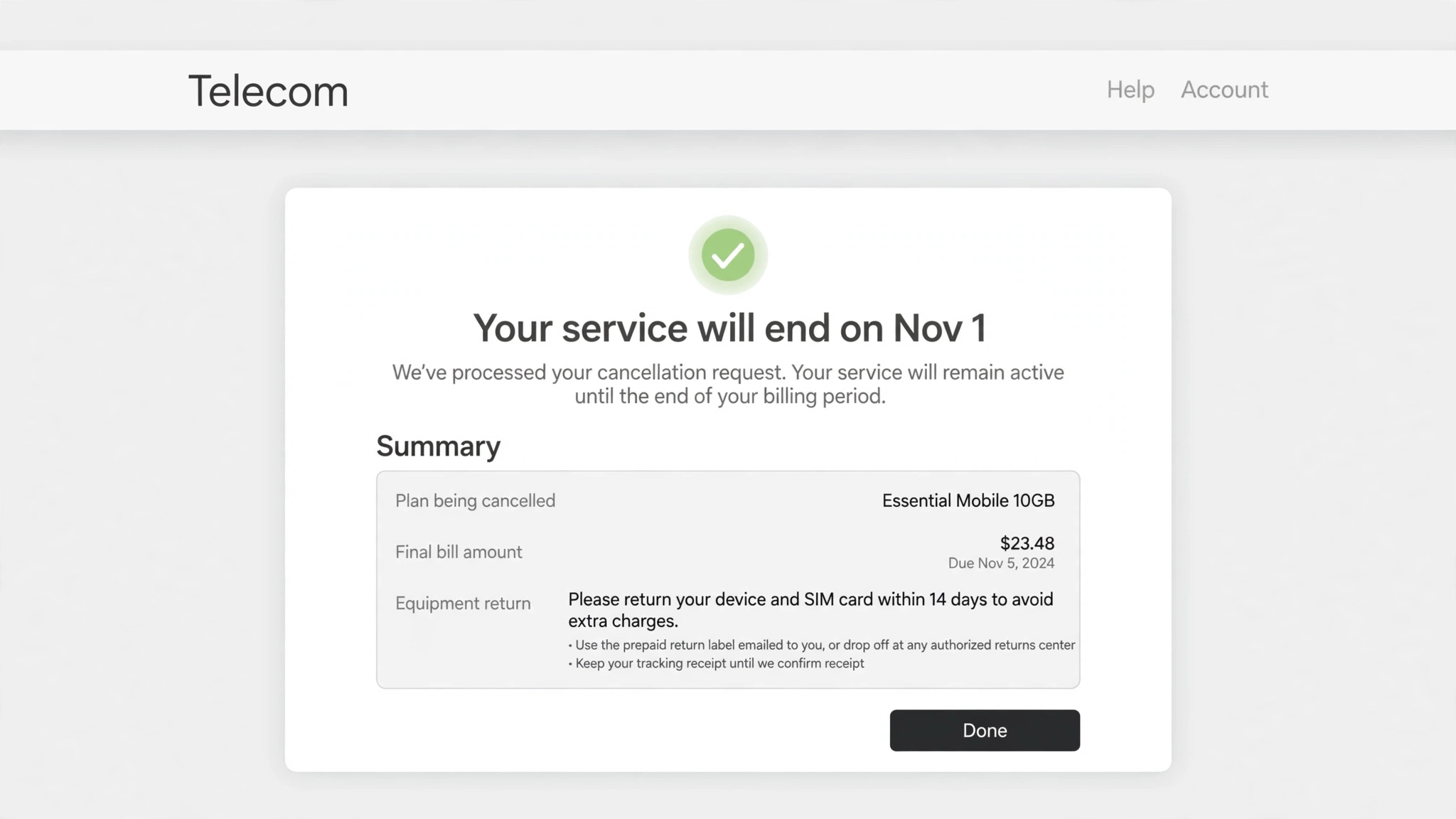
The exit confirmation
The exit itself: a calm confirmation with the final bill and equipment return spelled out. Recreated visual — client work anonymized for confidentiality.

Outcomes

  • Shipped a cancellation flow that makes exiting genuinely easy — no dark patterns.
  • Built structured save opportunities into the flow: upsells, promotions, and clear savings calculations presented before the final exit.
  • Regulation-ready: the flow gave the client a compliant online cancellation path — and a better exit experience — at the moment regulators were forcing the issue.

Reflection

Designing for the user who wants to leave and the business that wants to keep them forced every screen to be explicit about its tradeoff.

Full case study with visuals available in live portfolio reviews — contact sotimeart@gmail.com.
← Work

Design System Governance

A consulting engagement to build up a national retail brand’s design system and design governance. I audited their existing design system, hardened it with AI-assisted automation, and ran a governance workshop so their small design team could operate more professionally.

Design System Governance

Client

National retail brand · Client confidential

Role

Product Design Consultant, early summer 2026 (approx. 3 months)

Team

Creative director, associate creative director, product designer (me), and a junior designer.

Context

The client’s design system had gaps and inconsistencies — and maintaining it relied on slow, manual work. Beyond the system itself, the team lacked the governance practices to run design operations professionally.

The system wasn’t new: another agency had built it for them. The client brought it to us with two questions — is this actually good, and how can it be optimized? That made this an audit and a hands-on optimization, not a build from scratch.

The audit

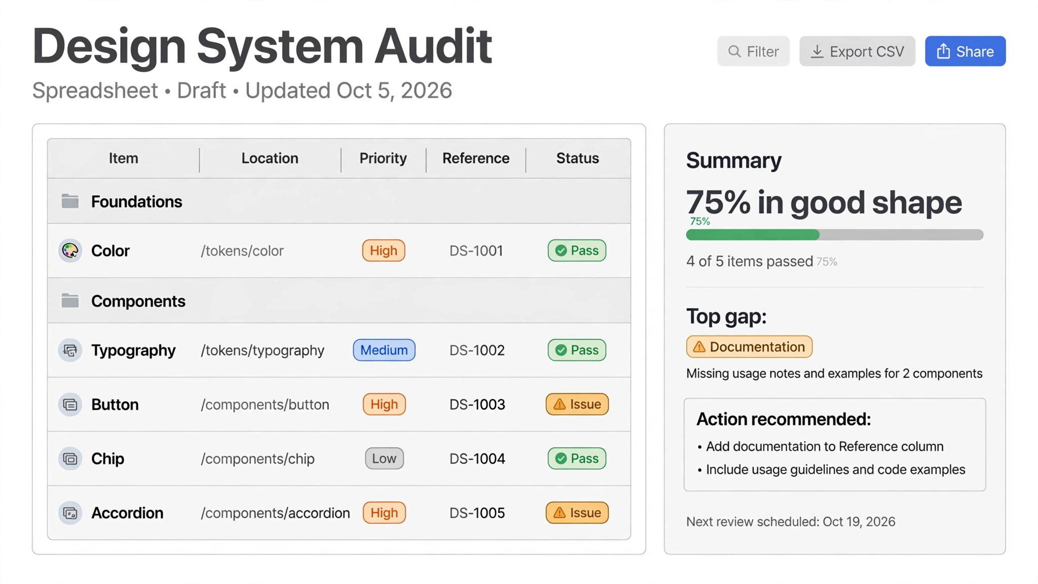
The audit ran in two parts. Foundations covered color, typography, icons, spacing, radius, borders, elevation, and opacity. Components swept the full set — buttons, chips, accordions, form fields, links, selection controls, modals, and more. Every item was checked for file location (does it live in Foundations, Components, or Templates?), priority, reference links, observations and action items, a problem category — token, structure, variant, accessibility, or documentation — and a pass/issue status, with screenshots and optimization notes.

The audit tracker and summary
The audit tracker: every item located, prioritized, and judged, with a summary readout. Recreated visual — client work anonymized for confidentiality.

The audit closed with a component summary — an overall health read, the components most open to optimization, and where to focus first — plus key observations, documentation opportunities, and missing items such as absent tokens and color mappings. We presented that readout to the client.

The optimization

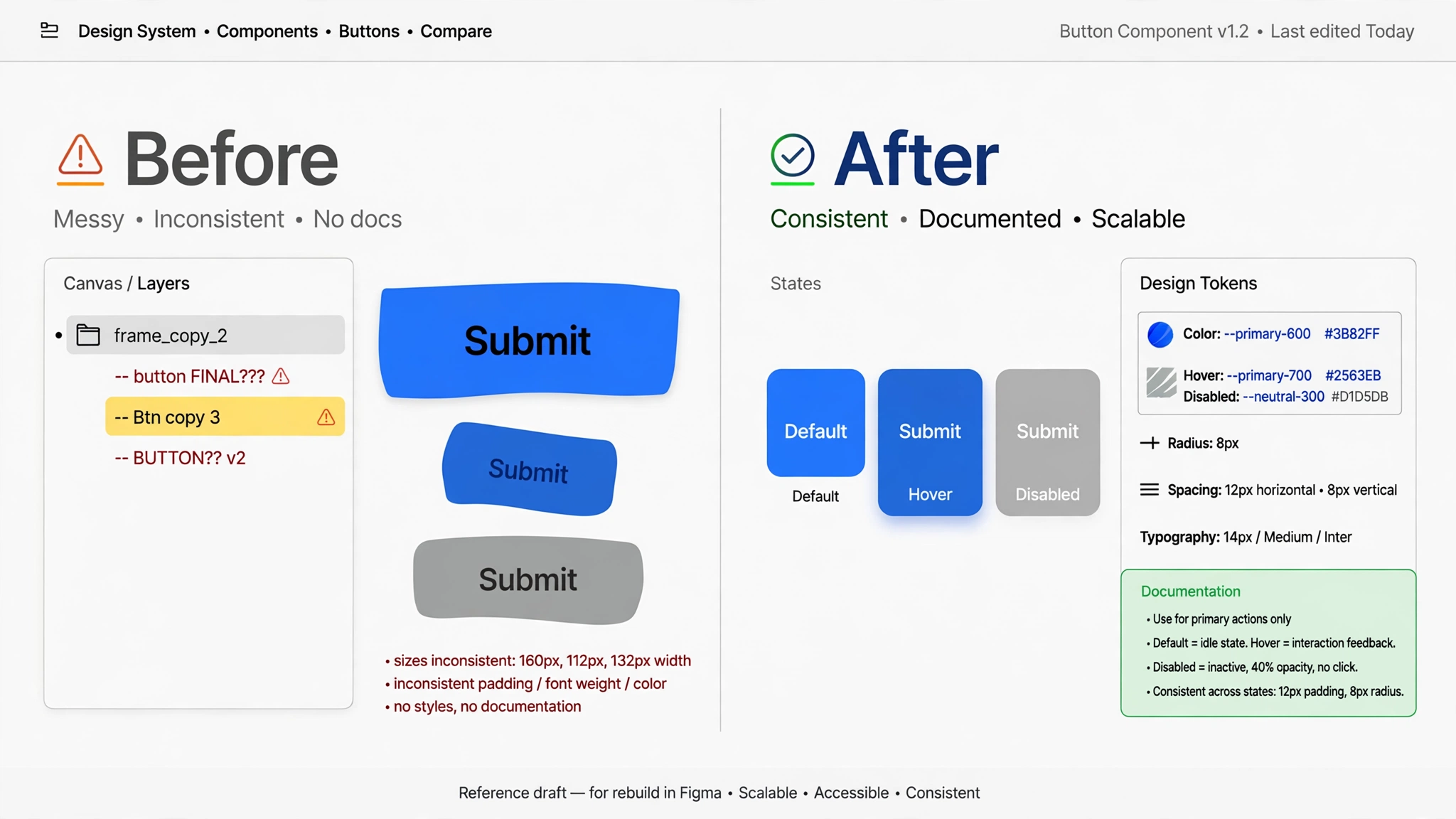
Working with a designer based in Mexico, I went through every component one by one inside Figma: whether the library was organized properly, whether labels were right, whether layers worked, whether components actually behaved when applied to templates, and whether screens used components and examples consistently. We fixed layer structures and made the whole set consistent in detail. For iconography — the team had been using self-made icons — I built master icon components so size, color, and style update automatically wherever an icon is used.

A component before and after optimization
One component, before and after: consistent states, tokens, and documentation. Recreated visual — client work anonymized for confidentiality.

AI-assisted automation

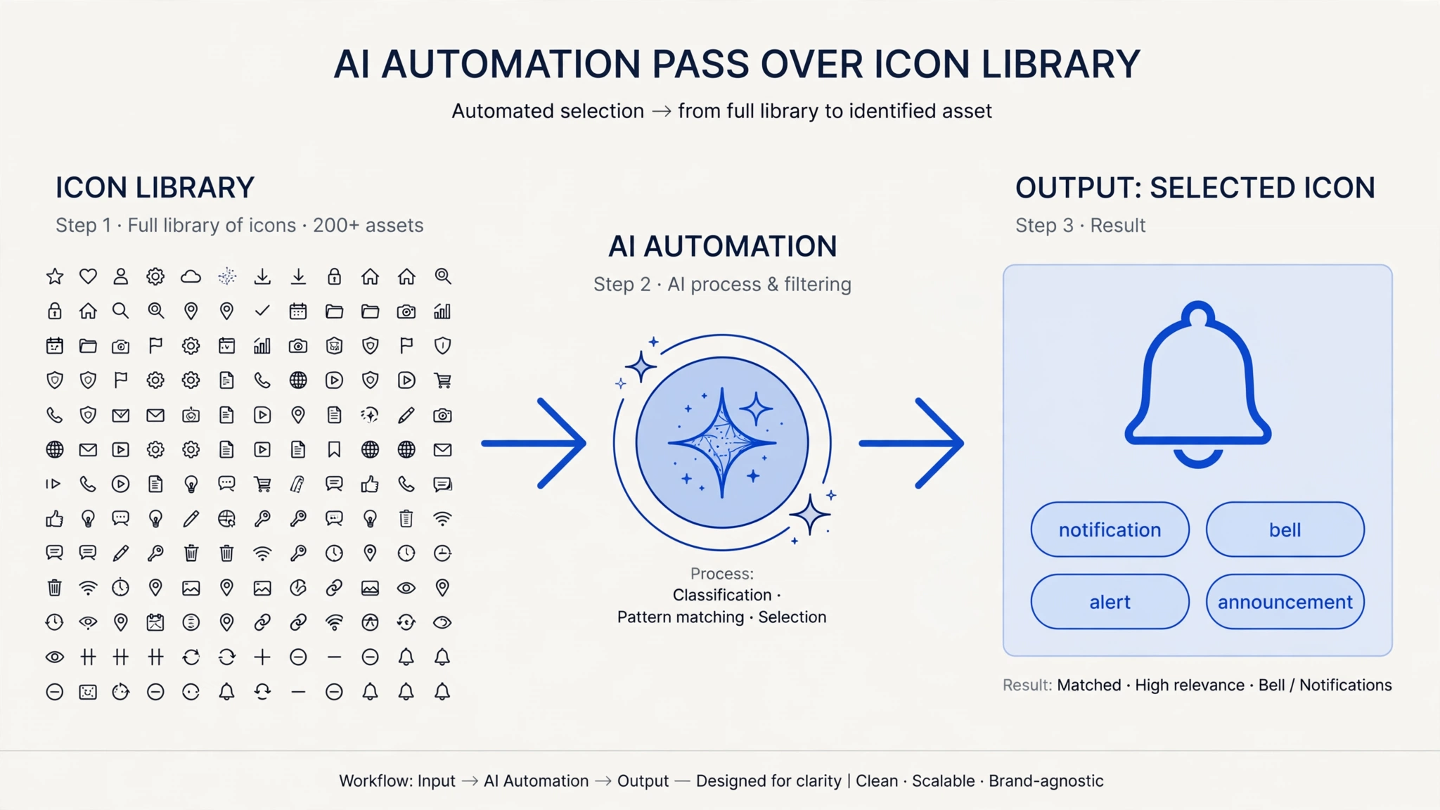
Figma’s MCP server had just made AI-driven Figma work possible, and our team had access to Claude. The clearest use: the icon library held hundreds of icons. I used AI to make icon sizes consistent and to write search keywords into every icon — a notification icon tagged not only “notification” but “bell,” “alert,” and “announcement,” so the library is actually findable. By hand, that metadata pass would have taken tens of hours; with AI, it took seconds.

AI automation pass over the icon library
The icon pass: hundreds of icons in, consistent sizes and search keywords out. Recreated visual — client work anonymized for confidentiality.

Governance, not just a handoff

The final workshop was in person — three of us (me, the associate creative director, and the creative director) with the client’s designers: their design-system team, the email and mobile-app designers who consume the system, and their design leader. We walked through design principles, the final system structure, and a governance and operations package built for them:

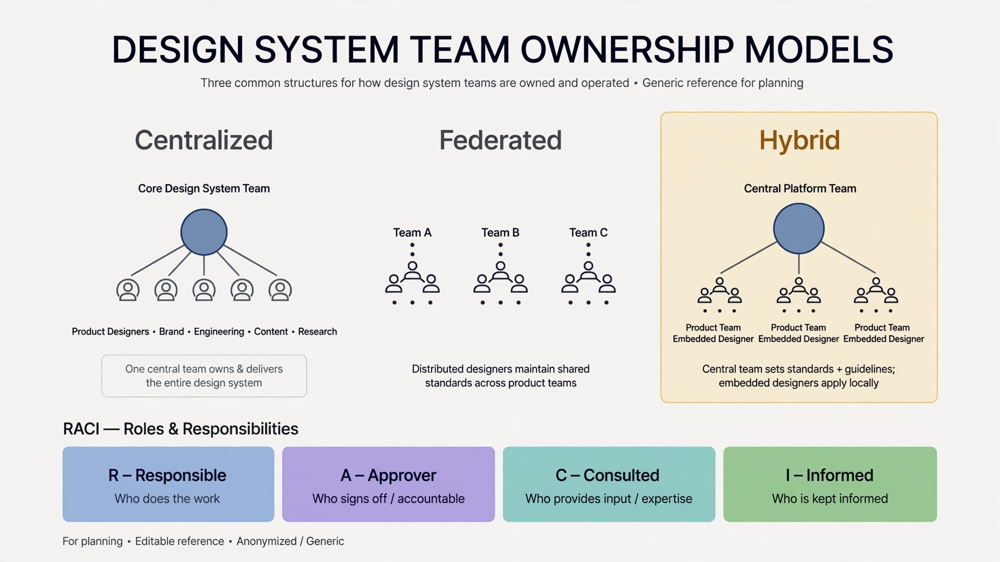
  • Ownership models — centralized, federated, and hybrid, and which fits their team.
  • A RACI diagram — who is Responsible, who Approves, who is Consulted, and who stays Informed, for designers and leadership alike.
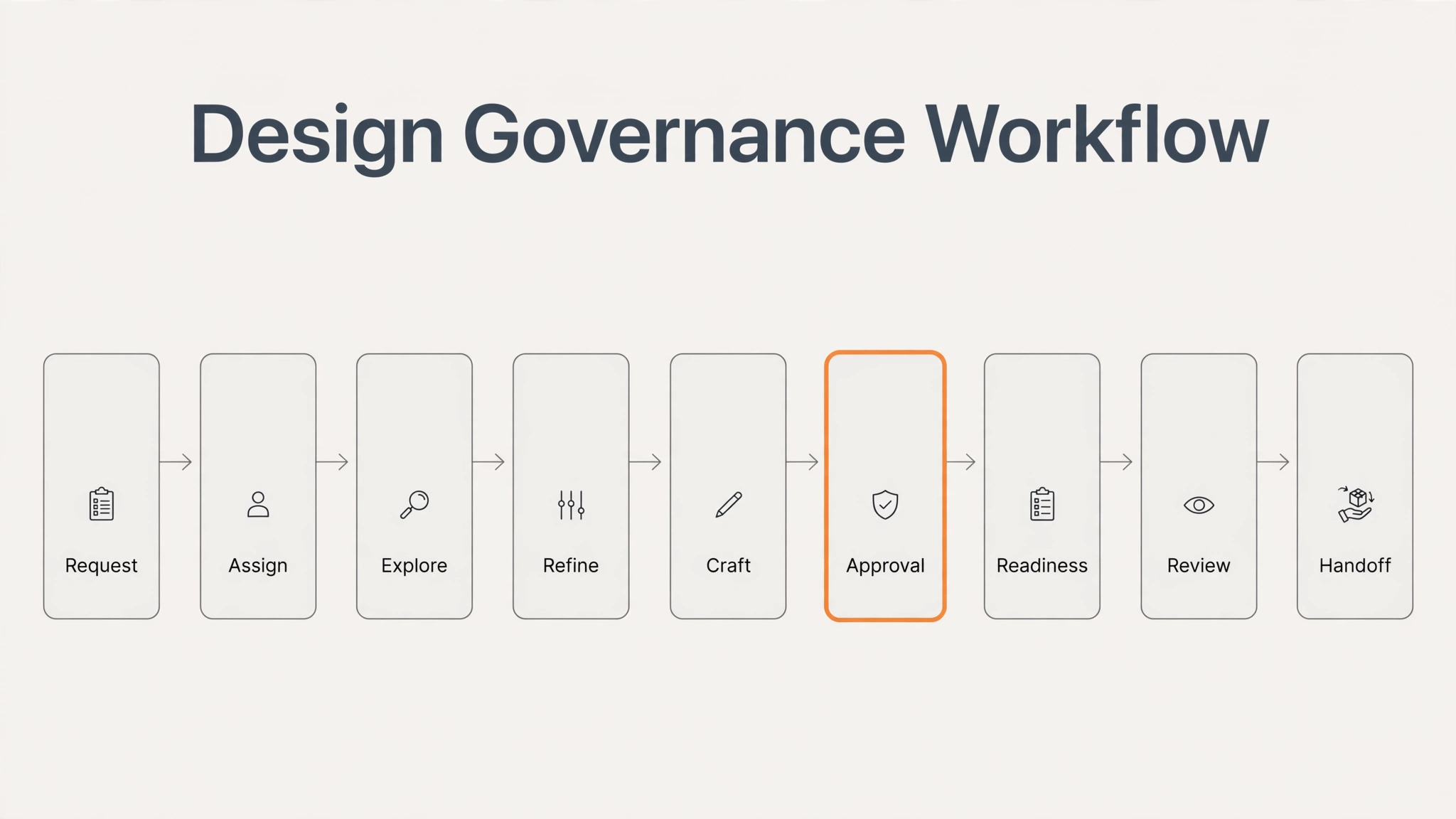
  • A governance workflow — how a request moves from intake through assignment, exploration, refinement, approval, readiness checks, and developer handoff.
  • File hygiene and structure — where components and color swatches live in Figma, and how files stay clean.
  • A documentation template and a process checklist — so reviews and docs stay consistent after we leave.
  • Publishing guidance — changelog practice, tooling, and when a release is ready to ship, plus a maintenance lifecycle for the system.
The governance workflow
The governance workflow, from request to handoff. Recreated visual — client work anonymized for confidentiality.
Ownership models and RACI
Ownership models and the RACI structure behind them. Recreated visual — client work anonymized for confidentiality.

Outcomes

  • The client was very satisfied with the engagement.
  • The small design team now operates more professionally, with a stronger system and governance practices in place.
  • Delivered: a full audit readout, a component-by-component optimized system, an AI-tagged icon library, and a governance package the team runs on its own.

Reflection

A design system is only as strong as its governance — components without operating practices decay, no matter how well they are built.

Full case study with visuals available in live portfolio reviews — contact sotimeart@gmail.com.
← Work

Health App Redesign

A redesign of a health app from a pharmaceutical company — used by patients to log their medication usage and find health information. I led the UI redesign across key screens, making the app easier to use and more engaging.

Health App Redesign

Client

Pharmaceutical company · Client confidential

Role

Senior UI Designer, 2025 (approx. 5 months)

Team

PM, a creative director, four junior UI designers, and me.

Context

The app had been built by another vendor on an aging platform, and it showed: a visual language stuck around 2010, a clunky experience, frequent errors, and more features than the experience could hold. In the meantime the company had rebranded into something far more refined — but none of that rebrand had ever reached the app.

Our firm had designed the company’s main website; now its product team reached out about the app, driven by user feedback and the client’s own read that the design was years behind.

My role

I was the senior UI designer — the most senior designer on the team below the creative director, working with a PM and four junior designers (one in the US, three in India). We split the screens divide-and-conquer, each taking areas matched to our strengths — and the assigning itself was my call: from the screenshot inventory in Figma, I chunked the work by feature and matched chunks to people by bandwidth and strength. On top of my own screens, I led the screen prioritization and presented the rationale to the client; I gave the junior designers their day-to-day direction and review feedback — the work a creative director would normally do; and I led the presentations of the finished design, walking through how we had designed and why.

Process

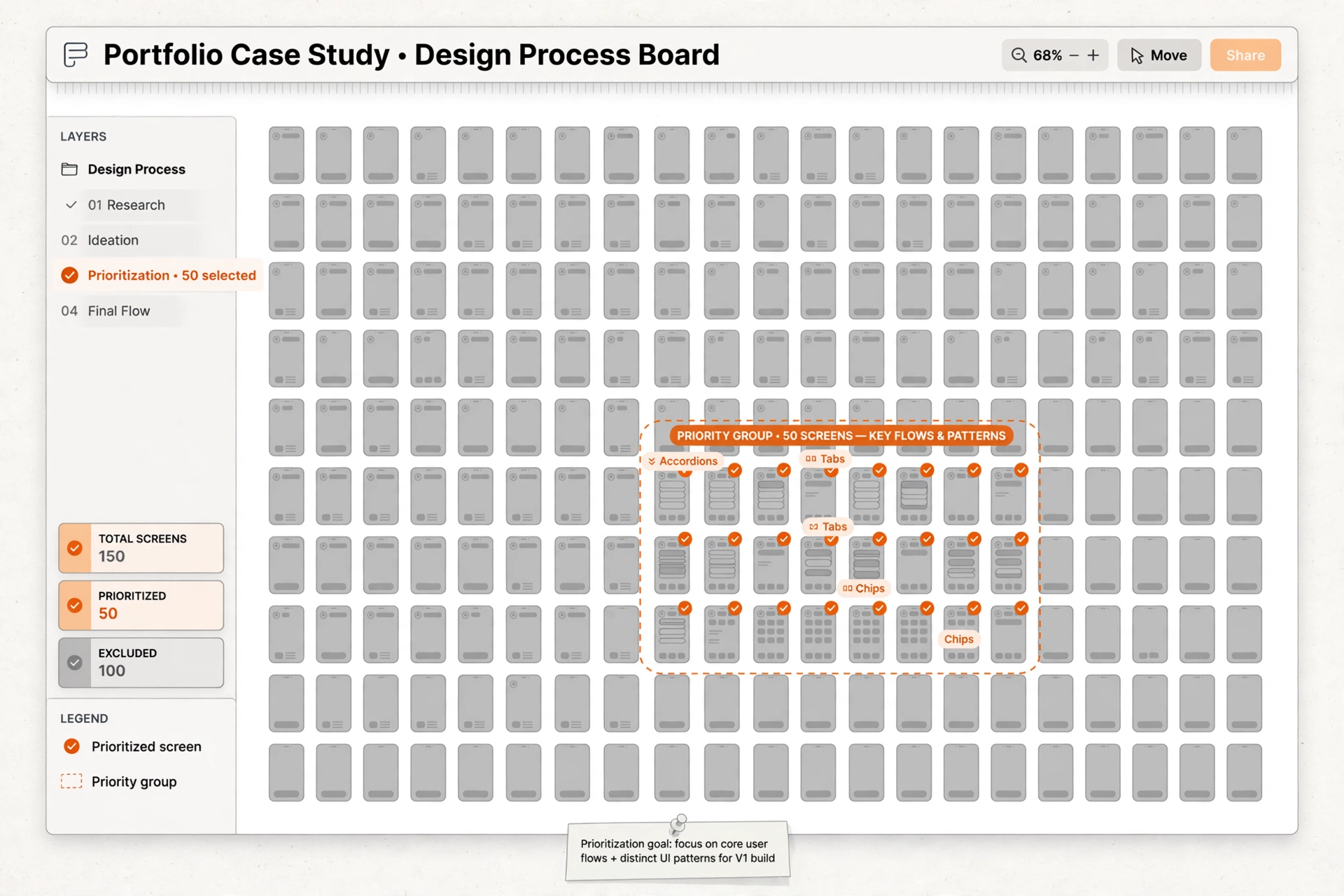
Inventory. We screenshotted every screen of the app into Figma — about 150 in total — to see the whole product at once.

The screen inventory and the prioritized 50
150 screens in, 50 prioritized — by importance and by UI-pattern coverage. Recreated visual — client work anonymized for confidentiality.

Prioritize. I led cutting 150 down to 50, on two criteria: how important the screen was, and UI-pattern coverage — a screen earned its place if it displayed a distinct UI type (an accordion, tabs, chips) the redesign had to solve, even if the screen itself wasn’t critical. I presented the selection, and its reasoning, to the client.

Concept, then the 50. We designed 10–20 screens first; the creative director reviewed, and the client approved the direction. Then the full 50, split across the team, reviewed together, and presented to the client. The 50 were the representative set: once front-end developers built them, the same UI could be carried across the hundred screens we hadn’t touched. Throughout, the work meant applying the new brand to the app, bringing in the new iOS design language, and adapting per platform so iOS and Android each felt native rather than foreign.

Key decisions

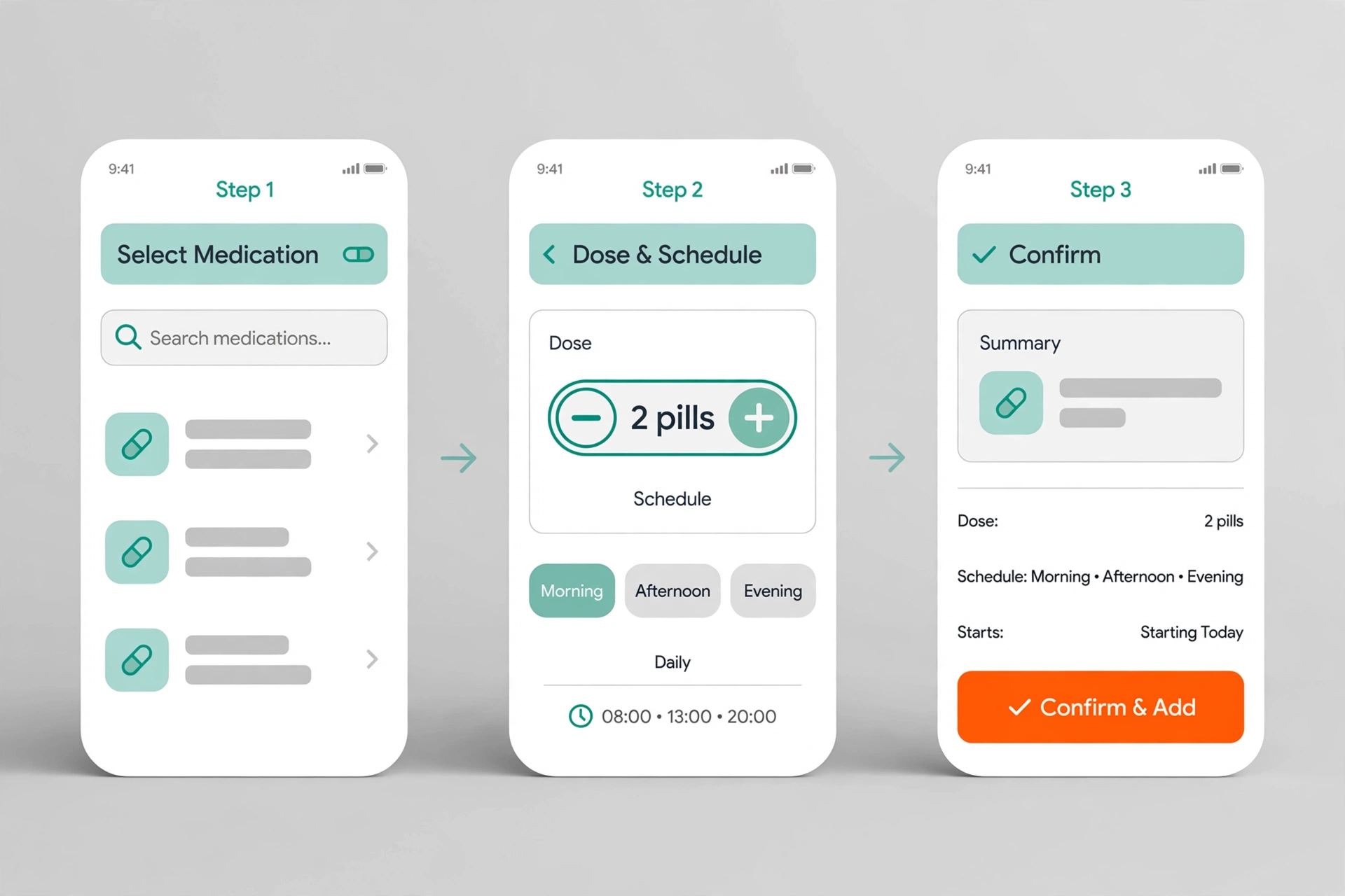
1. A new flow for the medication selection screen.

I created a new flow to make selecting medication easier for users.

The new medication selection flow
The new medication flow, in three steps. Recreated visual — client work anonymized for confidentiality.

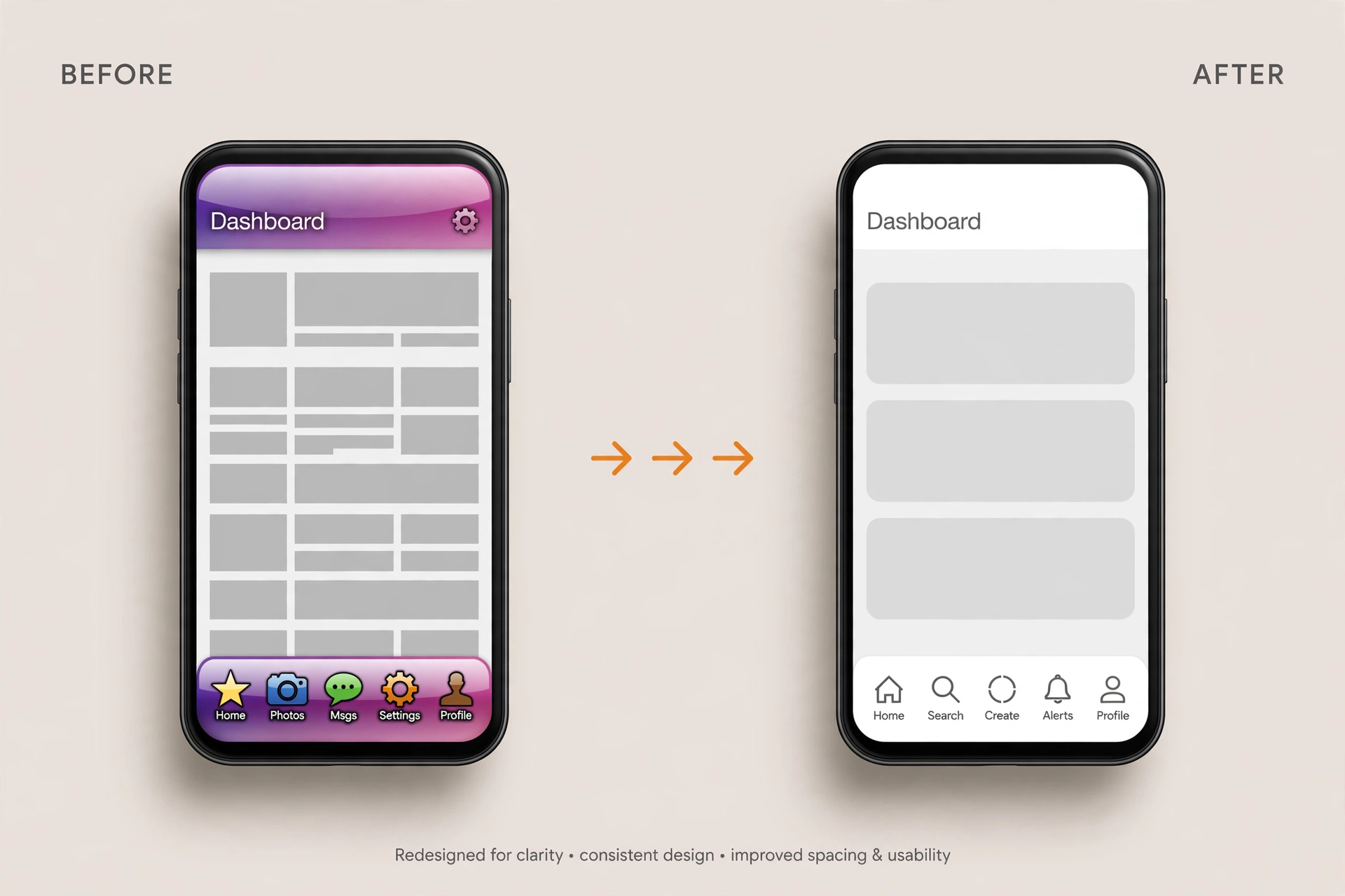
2. Bottom navigation rebuilt with native iOS and Android components.

Instead of custom components, I redesigned the bottom navigation around native components. The tradeoff: less bespoke visual control, in exchange for significantly reduced dev effort — and navigation that feels familiar rather than foreign to users.

Bottom navigation, before and after
Bottom navigation: custom before, native after. Recreated visual — client work anonymized for confidentiality.

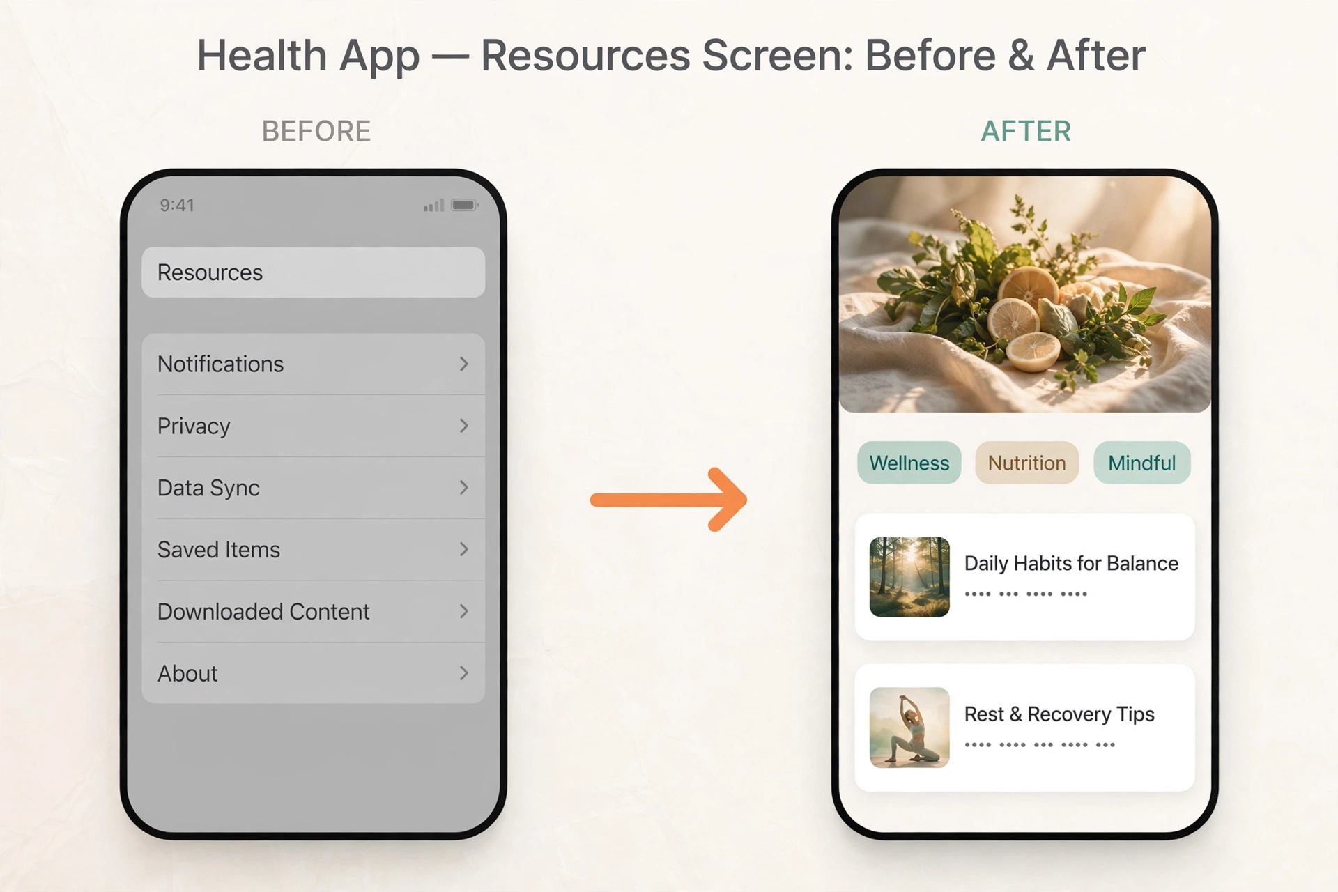
3. Resource screen rebuilt around the brand’s web design language.

The legacy resource screen felt like a settings screen, despite sitting in the middle of the bottom navigation. I referenced the company’s website — borrowing its hero sections and card styles — and turned the screen into a rich, engaging destination.

Resource screen, before and after
The resource screen: from a settings-like list to a destination. Recreated visual — client work anonymized for confidentiality.

Outcomes

  • The redesign shipped — the updated app is live in the App Store and widely used by the company’s patients to log their medication.
  • Today the app holds a 4.7-star average across 4.7K App Store ratings, and its review summary highlights exactly the two areas this redesign targeted: users find the logging process “simple and effective,” and they praise the supportive health information the app provides.
  • It became a go-to resource for users’ health information.

Reflection

The resource screen taught me how much framing matters — the same content feels like a settings page in one layout and a destination in another.

Full case study with visuals available in live portfolio reviews — contact sotimeart@gmail.com.
← Work

Hotel Website Brand Pull-Through

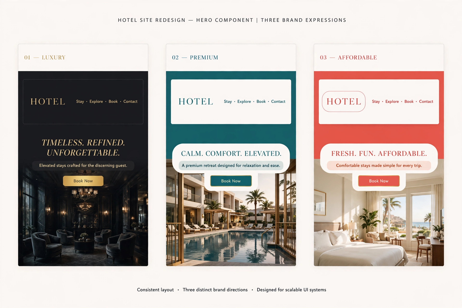
A global hospitality company operates a large portfolio of distinct hotel brands — but their websites all looked and felt the same. I redesigned the core UI components so each brand’s site expresses its own identity.

Hotel Website Brand Pull-Through

Client

Global hospitality company · Client confidential

Role

Senior UI Designer, 2021 (approx. 10 months)

Team

PM, creative director, dev team, and two senior UI designers (including me).

Context

Dozens of brands shared one web experience. The sites were too consistent across brands — brand identity was lost. User feedback made the cost plain: beyond an accent color and a logo, nothing differentiated one brand’s site from another, and guests were confused about which brand they were actually booking with.

My role

I was one of two senior UI designers on a US-based team, with a creative director and a PM. We split the portfolio by brand: the other senior took the luxury brands, I took the premium brands, and we divided the affordable brands between us.

The key decision

Brand-differentiated components instead of a one-size-fits-all system.

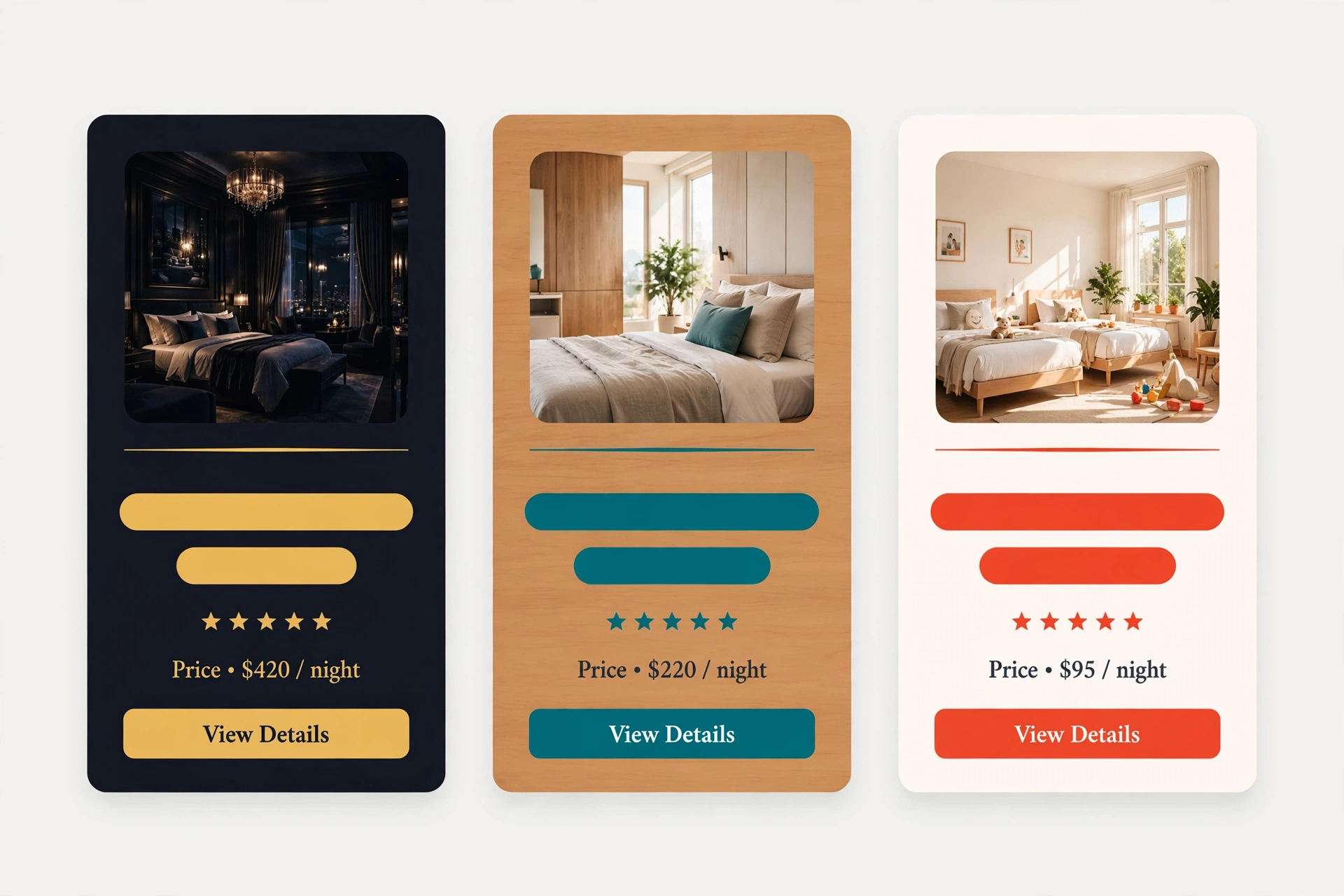
We deliberately traded cross-brand consistency for brand strength. Rather than keeping every brand on identical components, we redesigned each component to carry more branding. The tradeoff: more design surface to maintain across brands, in exchange for an unmistakable brand identity on every site.

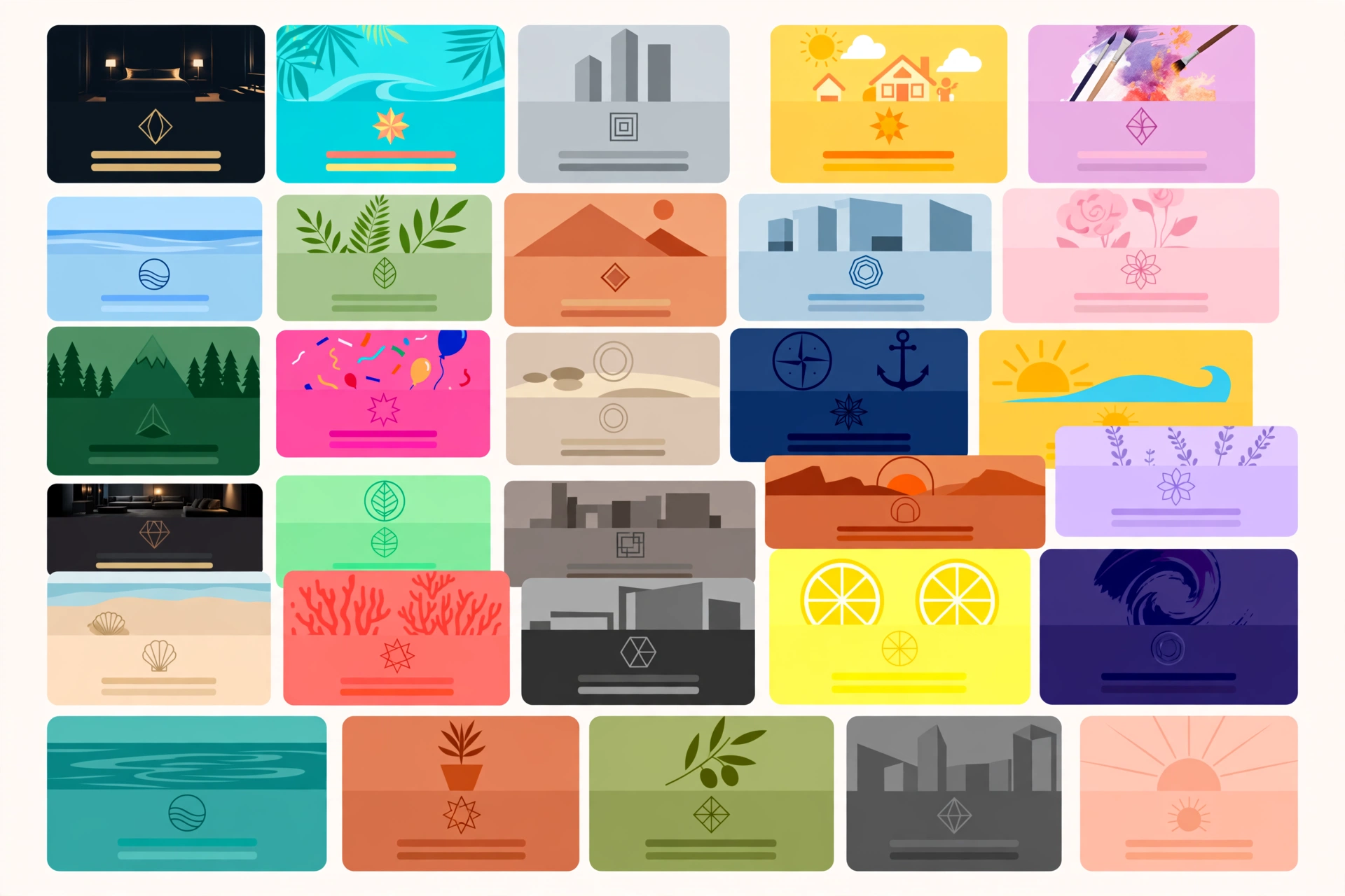
The same component in three brand expressions
One component, three brands — the structure stays shared, the identity doesn’t. Recreated visual — client work anonymized for confidentiality.

Process

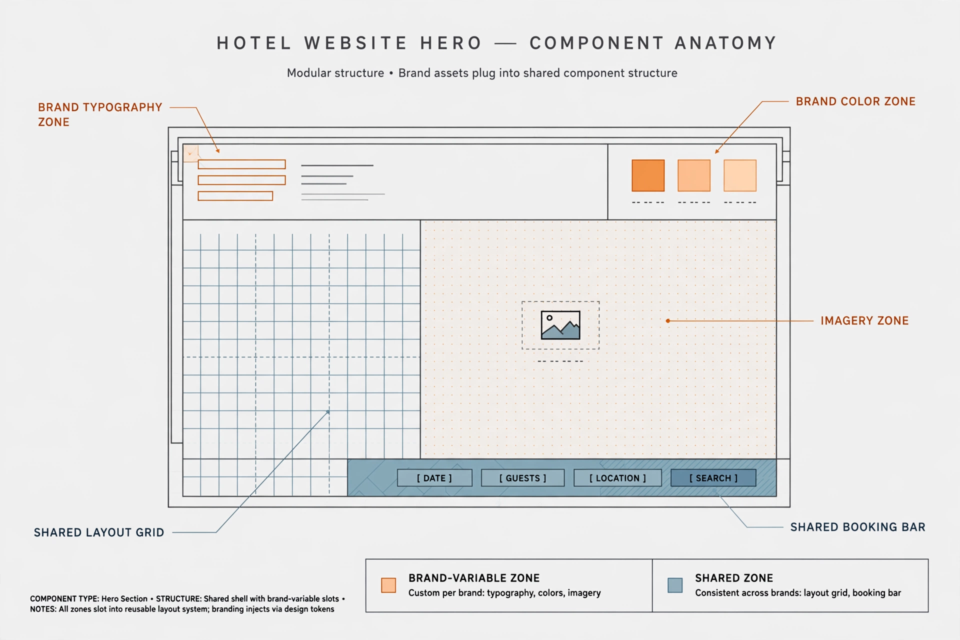
Redesign every component. Because these are commercial consumer sites, most components were informational — heroes, banners, carousels, image galleries, media controllers — and we redesigned all of them, plus everything else the sites needed. Each component kept its shared structure but was designed through each brand’s own style: the same component on two brand sites would look and feel like two different brands.

Component anatomy: shared structure, brand-variable zones
Component anatomy — where the shared structure ends and the brand begins. Recreated visual — client work anonymized for confidentiality.

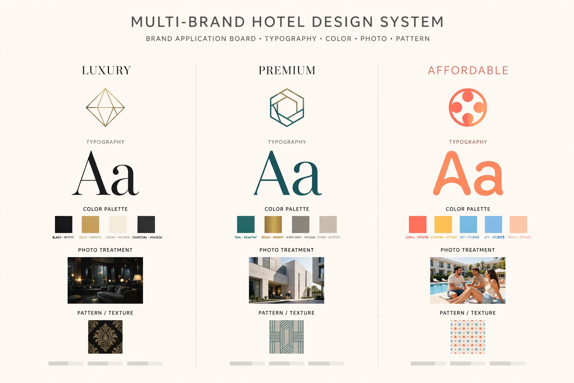
Sort global from brand-specific. For every component we decided which parts stay shared across all 30 brands and which parts exist to carry identity — typography, color, imagery treatment.

Brand application set across tiers
The brand application set: type, color, and imagery per tier. Recreated visual — client work anonymized for confidentiality.

Hand it off so it survives. This was before AI-assisted documentation, and the handoff was manual and enormous: Excel sheets documenting, per brand, the colors, fonts, and fine details; and a PowerPoint deck of over 250 pages with a screenshot of every component, tagged global or brand-specific, with explanations. Our PM was central to producing that documentation.

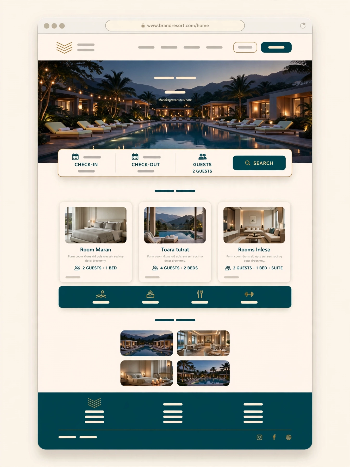
A full hotel page with the brand pulled through
A full page with the identity pulled through, top to bottom. Recreated visual — client work anonymized for confidentiality.
The brand matrix
The brand matrix — one system, thirty identities. Recreated visual — client work anonymized for confidentiality.

Outcomes

  • The client was very happy with the work, and the new designs were applied across all 30 brands — they’re still in use.
  • Hotel websites now carry their brands’ identity — guests are no longer confused about which brand’s site they’re on.
  • Delivered: a full component set redesigned per brand across 30 brands, from luxury to affordable tiers, plus the Excel/PowerPoint handoff system the client’s teams still work from.

Reflection

Across 30 brands I learned that identity lives in the details — the same component can feel like a completely different brand when the assets are applied with care.

Full case study with visuals available in live portfolio reviews — contact sotimeart@gmail.com.
← Work

Insight App

Insight is an internal iOS app for a global technology company. Data scientists and data analysts publish findings to the app; company leadership reads them and acts quickly.

Insight App

Client

Global technology company · Client confidential

Role

UI Designer, 2019–2020

Team

PM, lead designer, UX designer, UX researcher, QA, and me.

Context

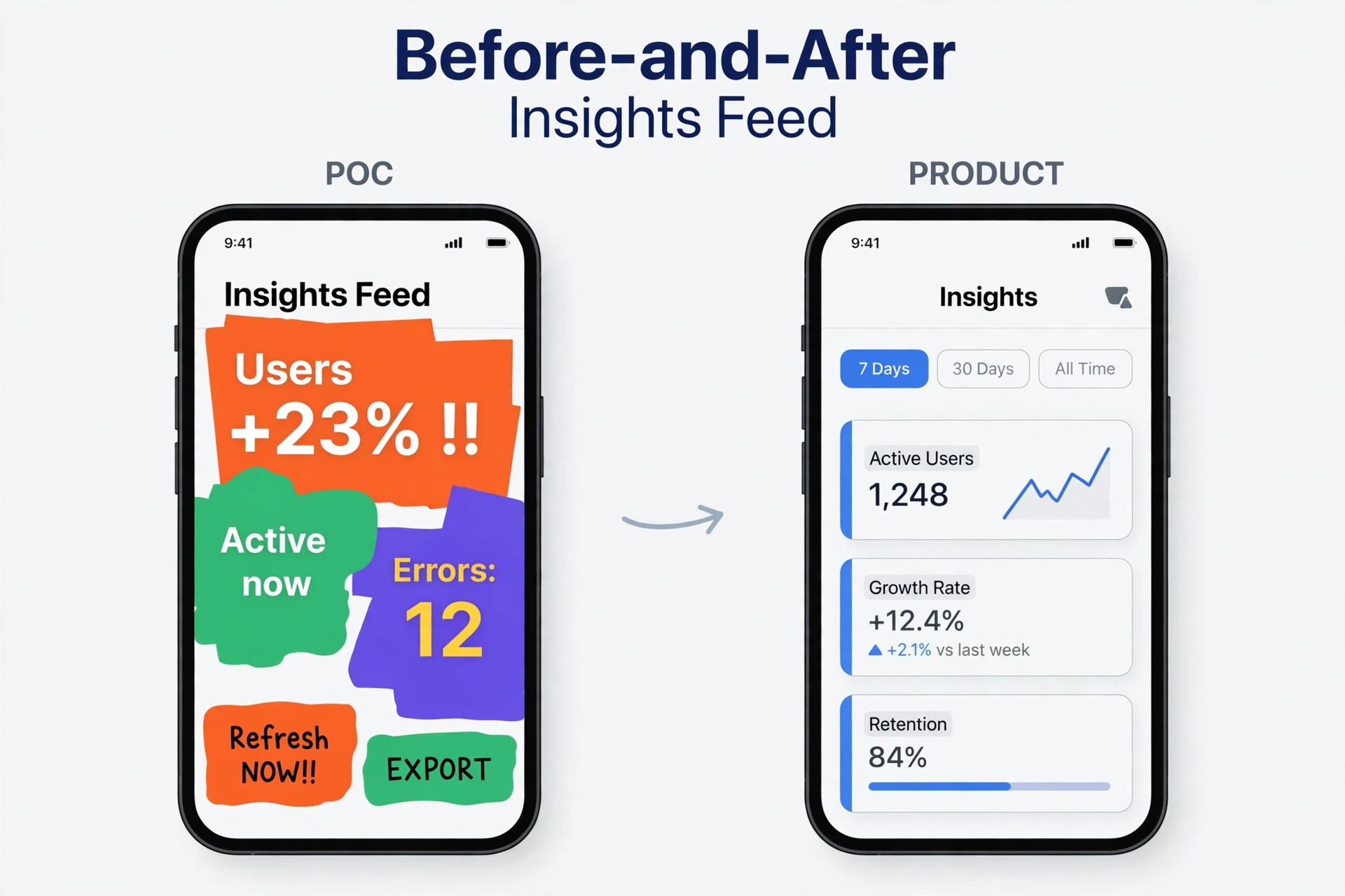
Leadership needed a fast, reliable way to receive data-science insights and act on them — and the organization needed one shared home for insights and the communication around them. A proof of concept had been built in about two weeks: functionally aligned with the client, but visually a mess. My job was to turn that rough POC into a real product — one the company’s own employees, and its senior leadership, would use every day.

From the two-week POC to the finished product
The two-week POC, and the product it became. Recreated visual — client work anonymized for confidentiality.

My role

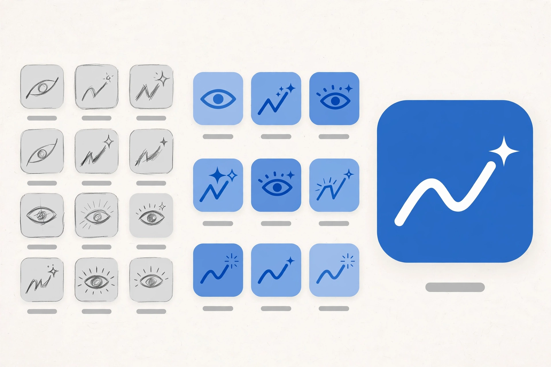
I was the UI designer, working from the UX designer’s low-fidelity wireframes. My surface was bigger than the app: I designed the iOS app’s finished screens, the companion web app used to publish insights into it, and — because the product was being created from nothing — the app icon and branding as well. The bar was set by the audience: the users were the client’s own employees, a famously detail-critical group, so the platform’s human-interface guidelines were followed strictly, and the design leaned on native components wherever possible.

App icon and branding process
The icon and branding process — the product had no identity until we made one. Recreated visual — client work anonymized for confidentiality.

Process

Design the app. Starting from the POC’s client-aligned functionality, I rebuilt the visual product screen by screen from the wireframes — natively, and guideline-strict.

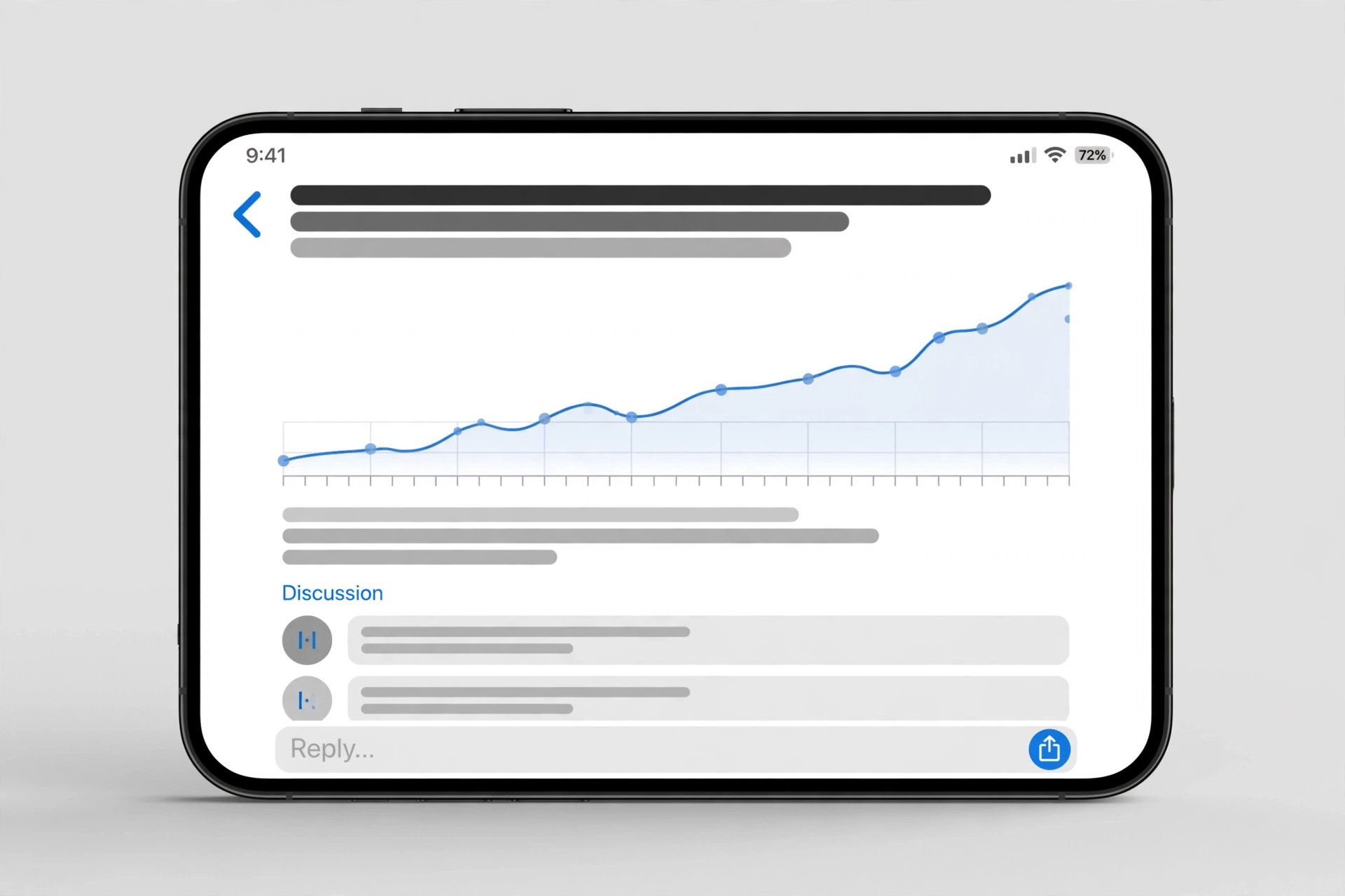
An insight, with its discussion thread
An insight and the conversation around it — the app doubled as the shared repository. Recreated visual — client work anonymized for confidentiality.

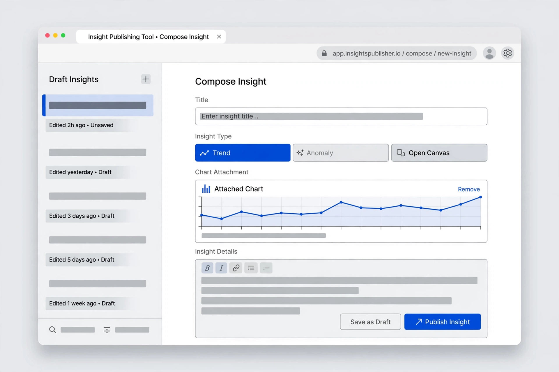
Design the publishing side. Insights don’t appear by themselves: I also designed the web app that data scientists and analysts use to compose and publish findings into the app.

The publishing web app
The publishing web app — where insights are written and shipped to leadership. Recreated visual — client work anonymized for confidentiality.

Ship the MVP, then grow it. The MVP shipped to the internal enterprise app store with two insight types: Trend and Anomaly. When the client asked for a more flexible type, we added Open Canvas — free-form insights, bound to no fixed type. Then Performance Cards. The final phase of my time on it: Tableau insights, viewable directly in the app.

Key decisions

1. Accent color: the company’s signature blue instead of random color.

The POC used random colors. Since this was an internal product, I argued it should speak the company’s visual language and use the company’s signature blue as the accent color. In the native environment, accessibility color variants were already handled by the system, so this cost the team nothing extra. The team agreed.

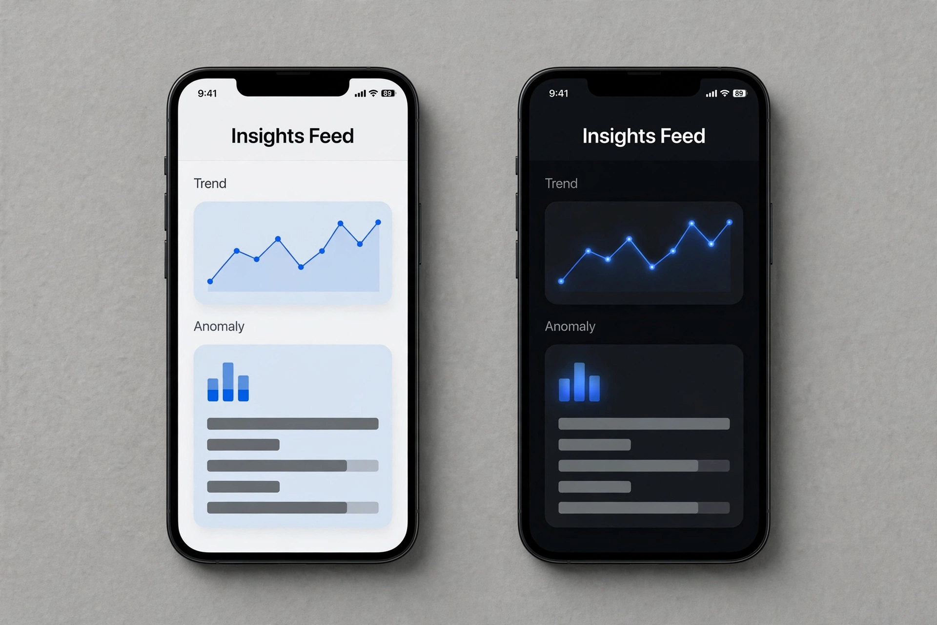
2. Dark mode from the start.

I initiated the move to dark mode: battery life and screen brightness were real concerns for eye comfort at the time, and dark mode addressed both. The team and stakeholders agreed.

The same screen in light and dark mode
Designed for both from the start — light and dark. Recreated visual — client work anonymized for confidentiality.

Outcomes

  • Shipped to the company’s internal enterprise app store.
  • Adopted by company leadership, one level below the C-suite: data scientists and data analysts push insights to the app, and leadership views them and acts fast to reduce potential risk.
  • Became the shared repository for insights and the conversations around them — and kept growing after launch, from two fixed insight types to Open Canvas, Performance Cards, and in-app Tableau insights.

Reflection

When the audience is decision-makers under time pressure, restraint is a feature — clarity and speed beat richness every time.

Full case study with visuals available in live portfolio reviews — contact sotimeart@gmail.com.
← Work

myColorado

As the State of Colorado’s official mobile app, myColorado provides a simple, secure and convenient way to access state services right from the palm of your hand.
myColorado

Project Type

Mobile app UX/UI design

Role

As a lead UX/UI designer, I developed high-fidelity wireframes, interactive prototypes, and user flows. In collaboration with a UX manager at State of Colorado OIT office, we conceptualized and turned abstract ideas into mobile solutions.

Skills

Sketch – Wireframe and screen design
InVision – Prototyping and client communication

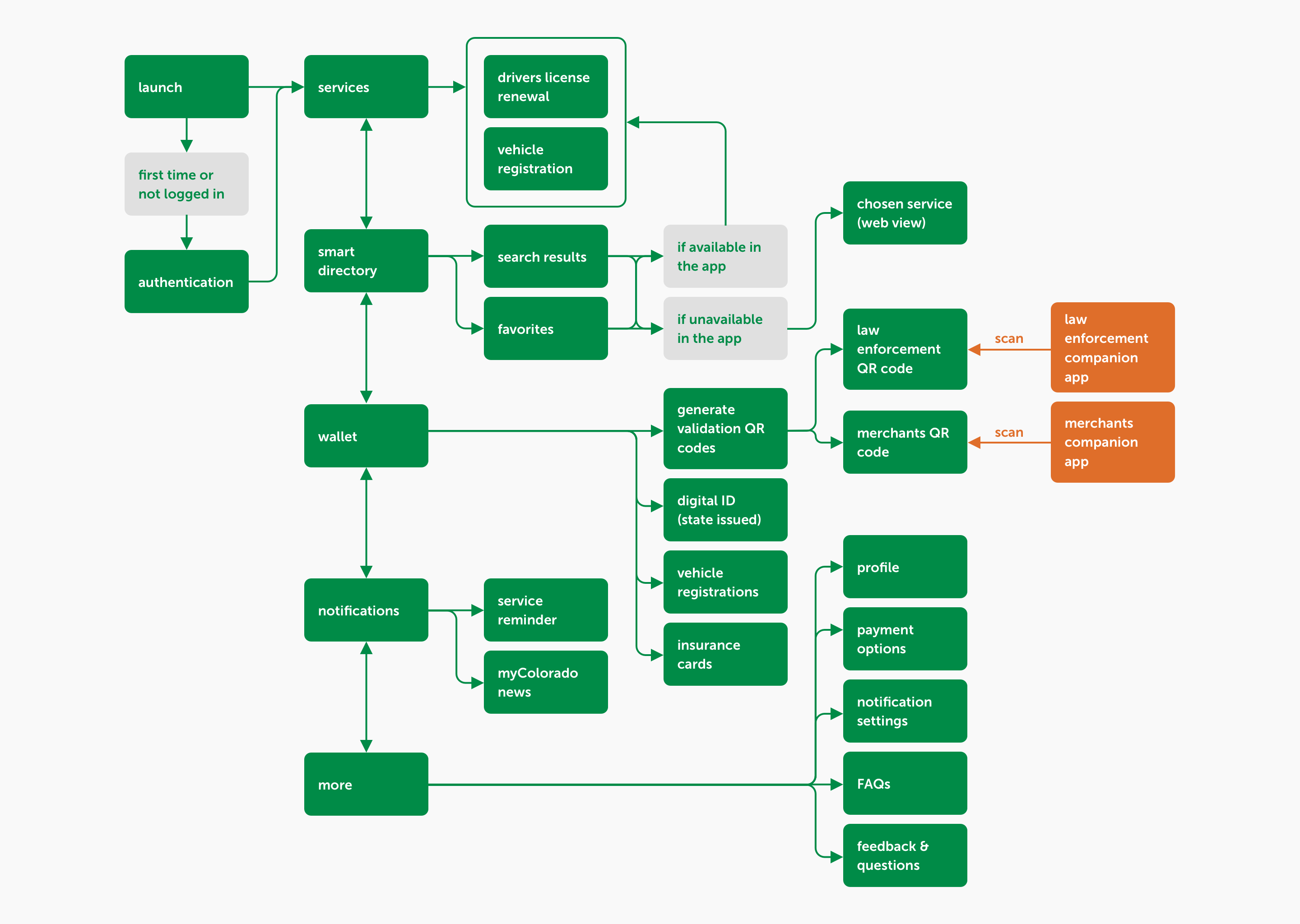
User-flow

myColorado user flow

Features

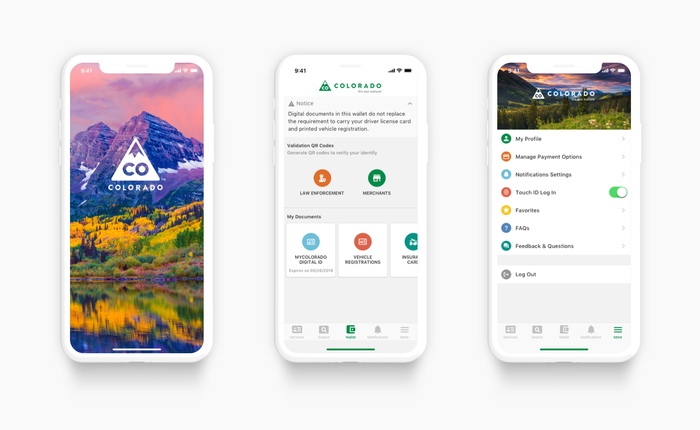
myColorado features

With myColorado, you can:

  • Renew your driver license and vehicle registration
  • Store vehicle registration and insurance information in the digital wallet
  • Receive notifications about important state news
  • Use the State Services smart search function to quickly find official online government resources in one place

Outcome

The app was launched on both Play Store and Appstore. Some Coloradans already taking the advantage of simple and quick drivers license renewal by using the app.

← Work

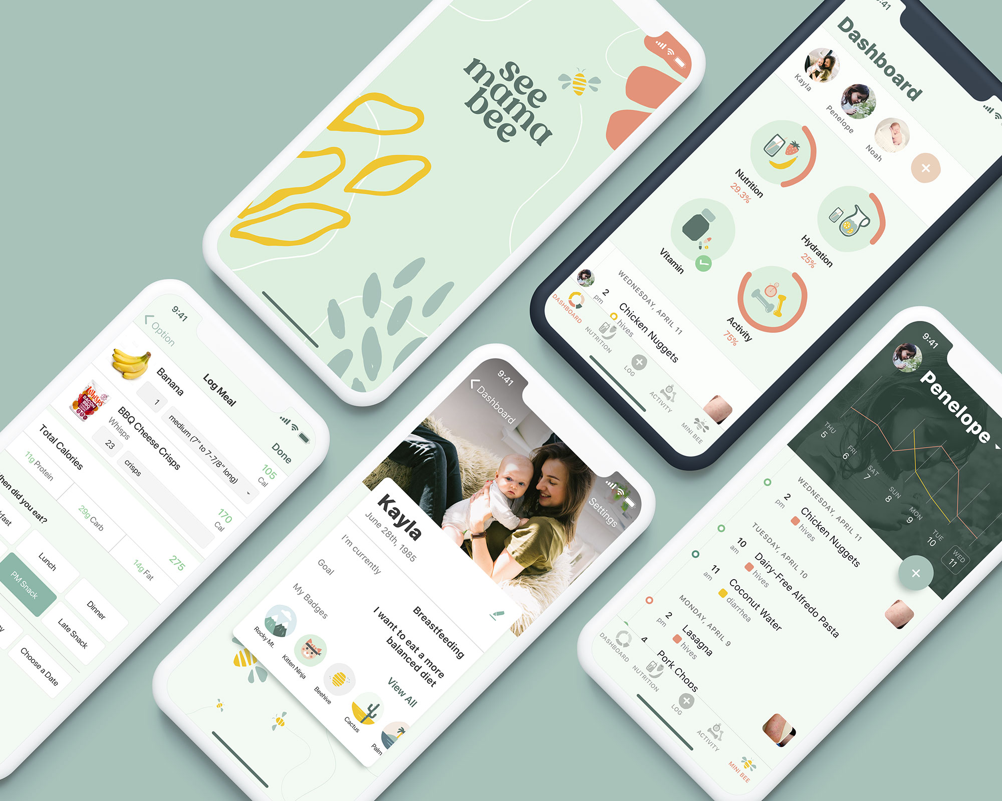
See Mama Bee

SeeMamaBee is a lifestyle app for the modern mama. Features include tracking their lifestyle choices and the allergies of their minis through a fun, playful interface.

See Mama Bee

Project Type

Mobile app interface design

Role

Brainstormed features for the target audience, and created a visual interface to match the branding. Ensured design functionality with nutrition information API integration.

Skills

Sketch – Wireframe and screen design
Principle – Created animation to simulate micro interactions.
InVision – Prototyping and client communication

Features

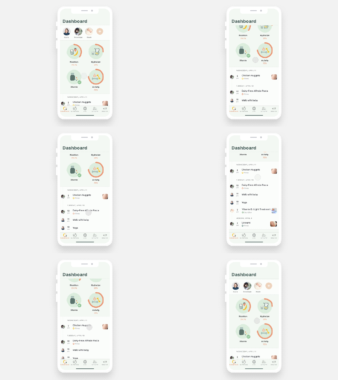
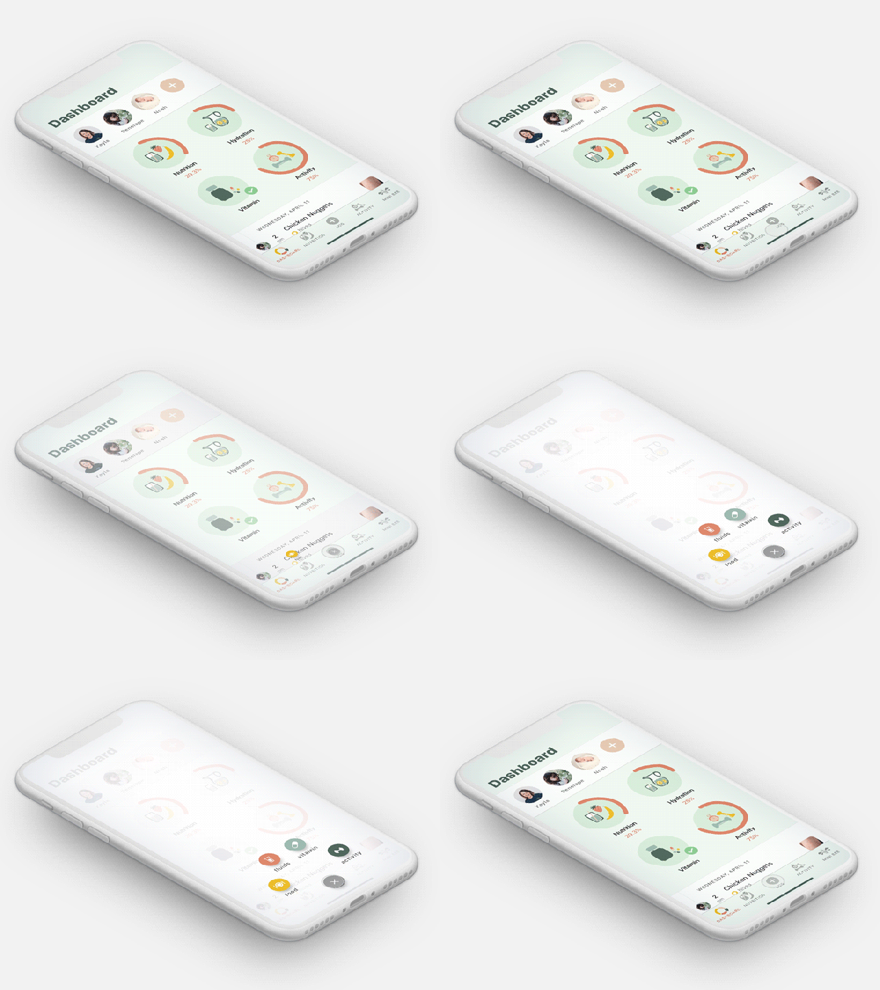
See Mama Bee dashboard

Dashboard

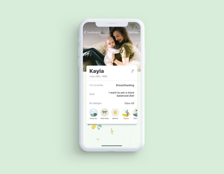
In the dashboard screen, users can view all of the information, such as the mother’s nutrition tracking, a combined timeline of mom and children, and access to their own or their children’s profiles.

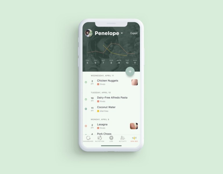
See Mama Bee mini bee tracking

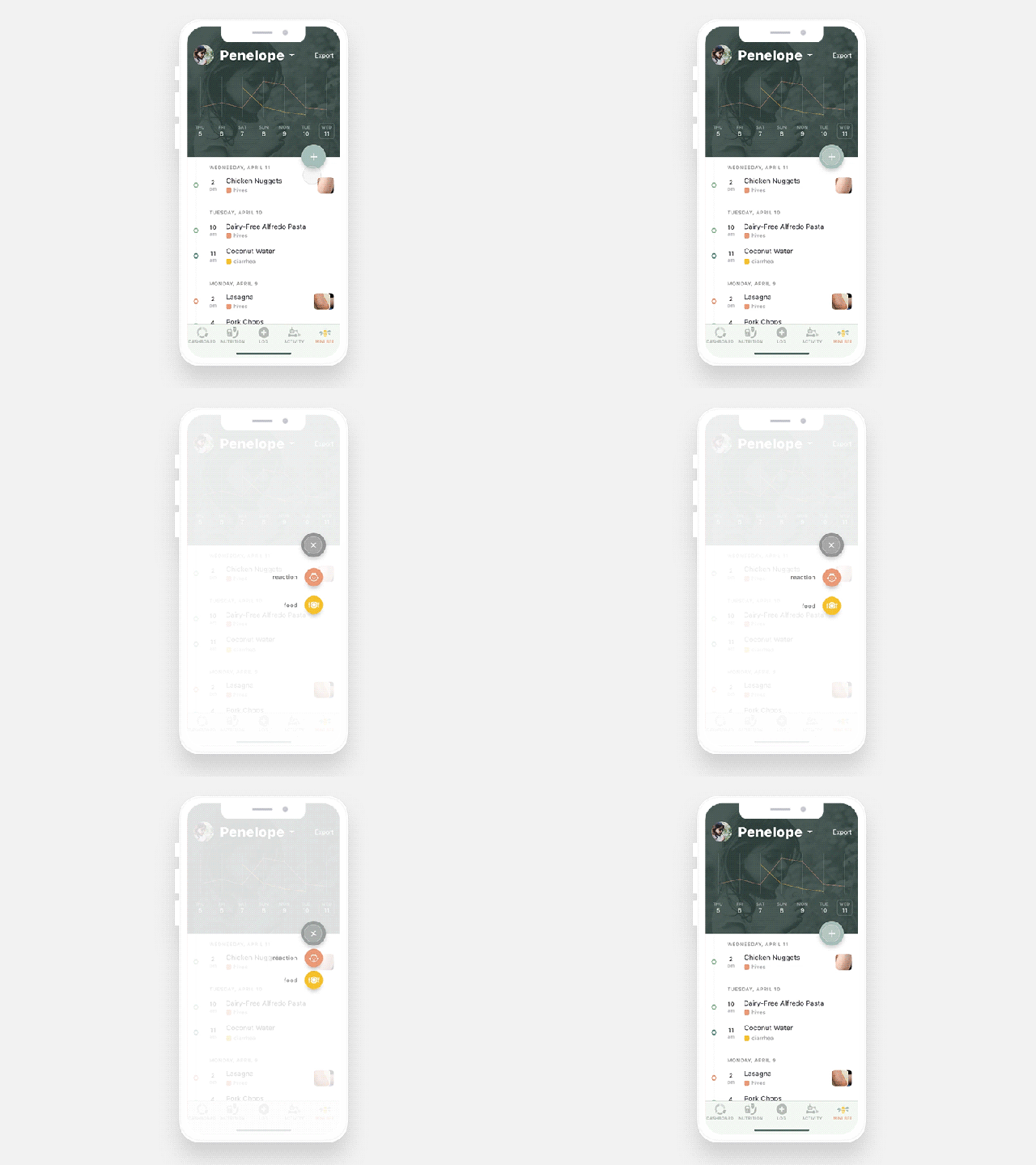
Mini Bee Tracking

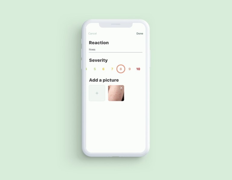
Once mothers register their children, they can track allergies, symptoms, and reactions. Users can also upload photos of reactions if they want. Mothers can check their children’s conditions in bar graphs as well as a timeline.

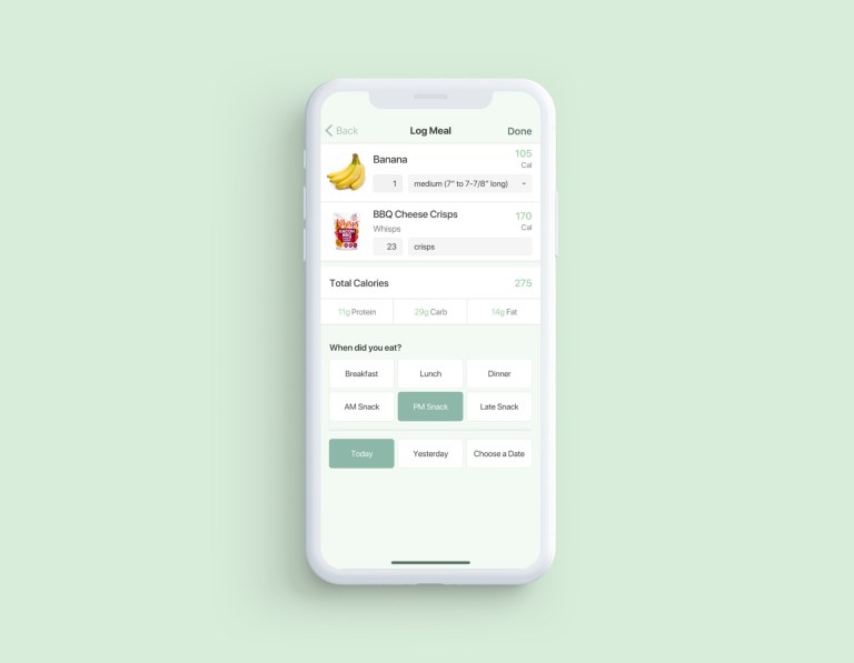
See Mama Bee log meal

Log Meal

Tracking nutrition is important for pregnant moms. We designed a nutrition log screen based on Nutritionix, the food log API.

Outcome

See Mama Bee app screens
See Mama Bee mom profile
See Mama Bee log reaction
← Work

EnVision

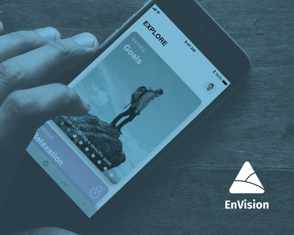
EnVision is a guided visualization app designed to help you overcome what holds you back from living your best life.

EnVision

Project Type

Mobile app UX/UI design and branding

Role

Created the branding assets such as the logo and brief branding guidelines and designed all of the flows and screens for the mobile application.

Skills

Sketch – Wireframe and screen design
InVision – Prototyping and client communication

User-flow

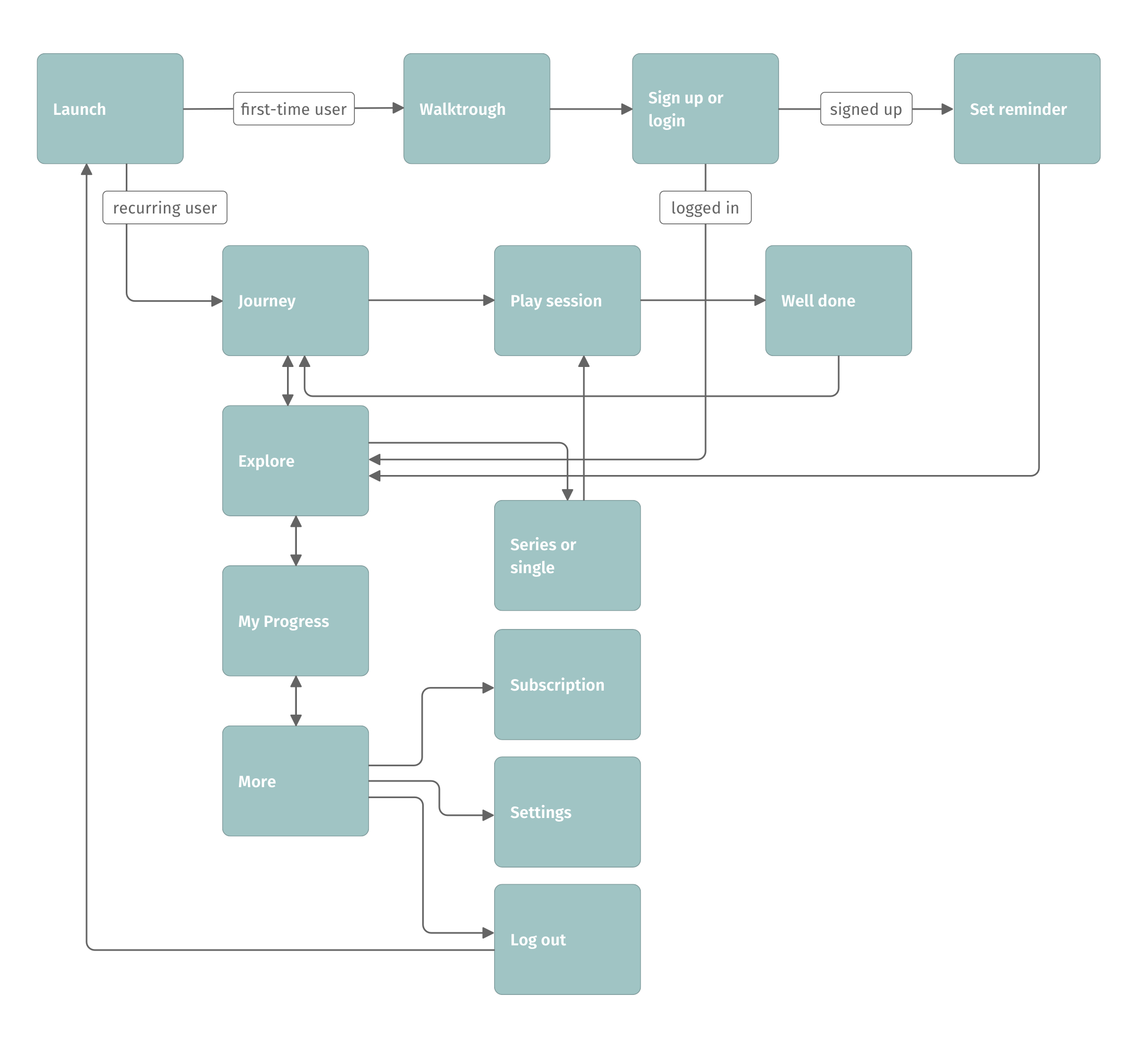
EnVision user flow

Features

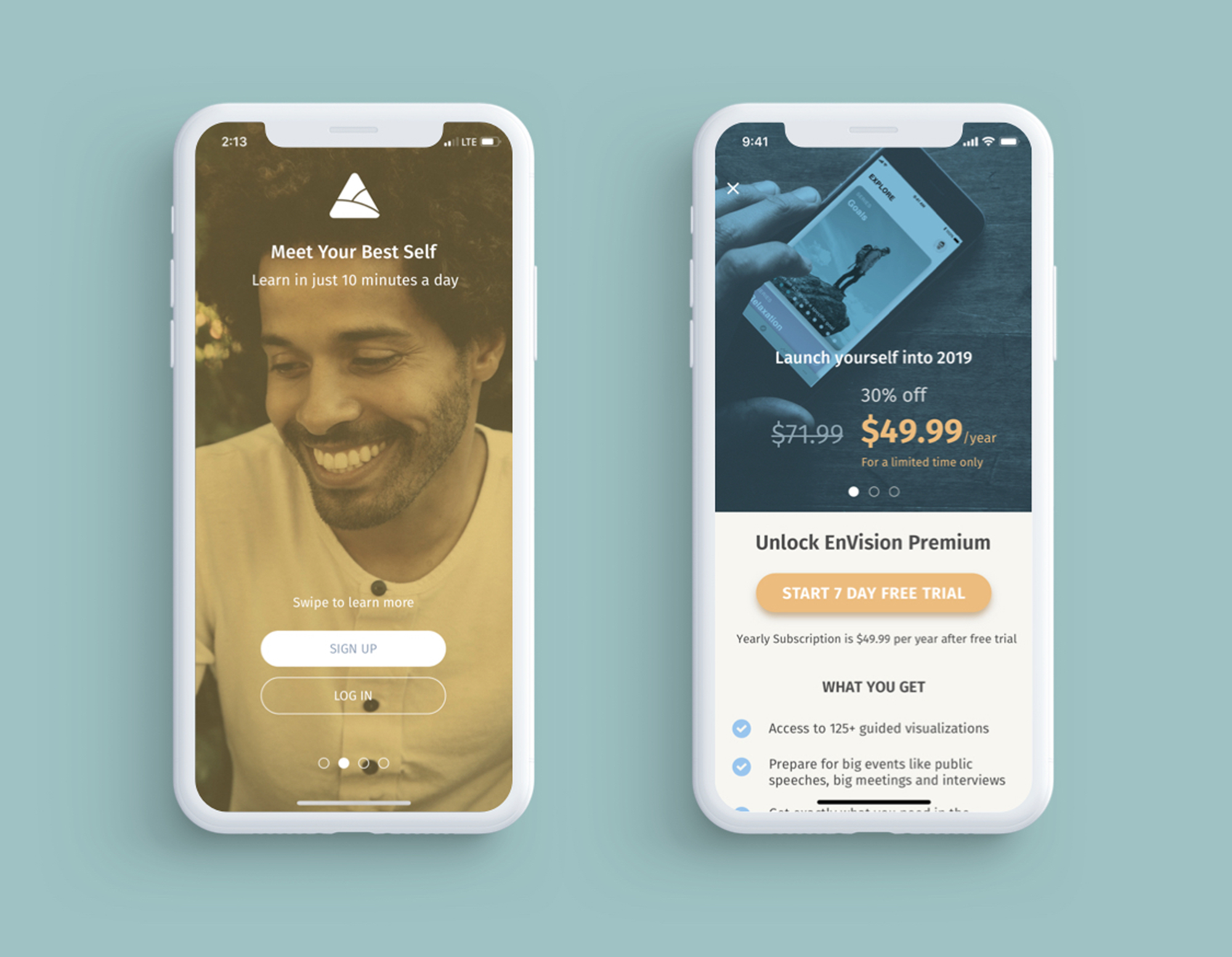
EnVision onboarding and subscription

Easy Onboarding and Subscription

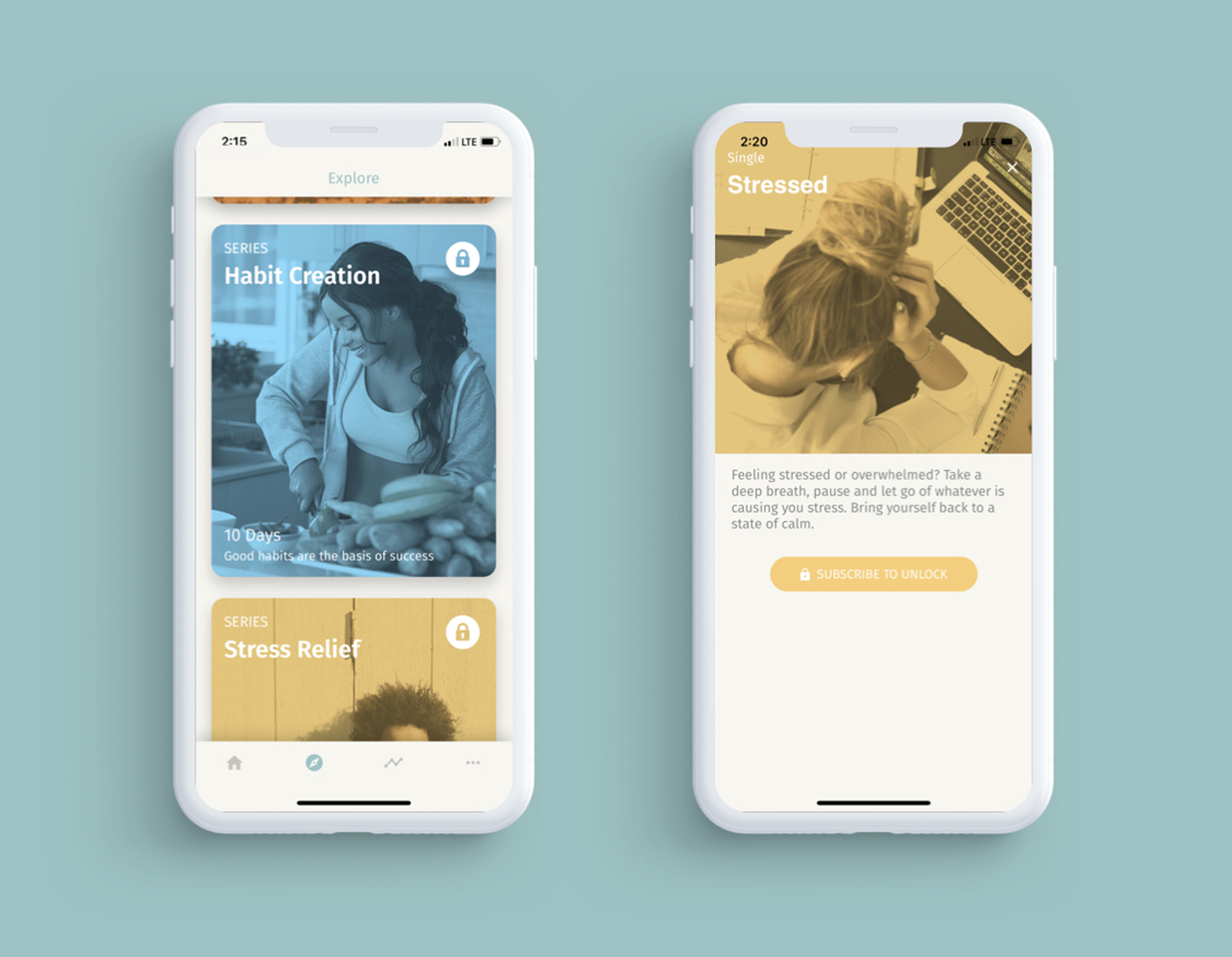
For any public user facing app, an easy onboarding process is very important. I wanted first-time users to comprehend the core concept of the app and set a reminder for their first meditation session during their initial use.

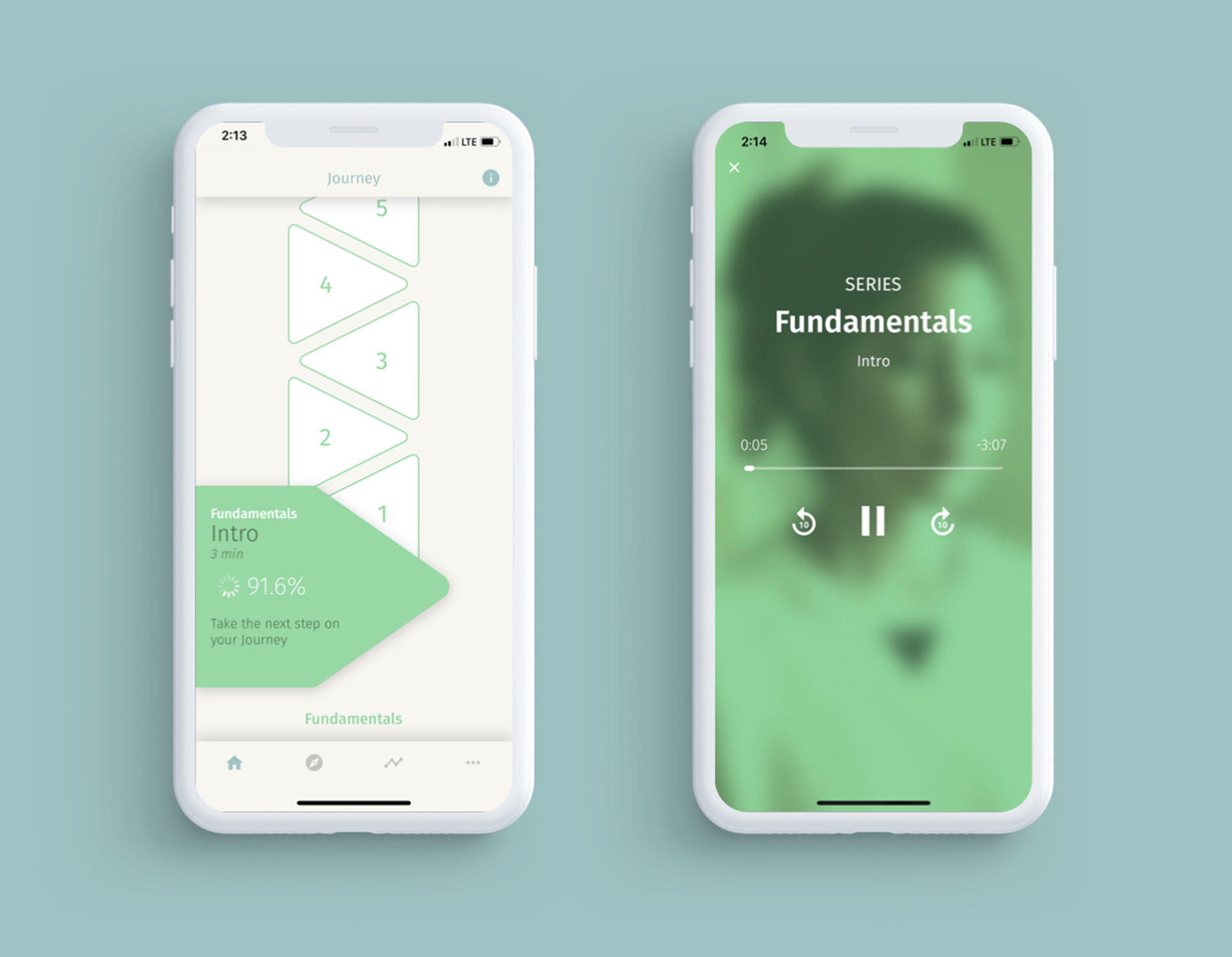
EnVision timeline and play

Timeline and Play

The core functionality of the app is listening to meditation guides and keeping a record. We came up with the stacked triangle shape timeline because it is aesthetically pleasing and utilizes the screen space more efficiently. The triangles are the call-to-action button as well as status indicators for each session.

EnVision explore packs and singles

Explore Packs/Singles

We used duotone images to make the entire app look more consistent and professional. We wanted to emphasize subjects with relevant images.

Outcome

The app is currently live on the App Store. Rated 5.0 out of 5 with 47 ratings.

← Work

Firepoint

Firepoint is a customer-relationship management software specifically for a real estate agents.

Firepoint

Project Type

iOS and Android mobile app design.

Role

I conceived of new features for the mobile application with a PM and UX designer on the client side, and designed mobile app screens based on the existing web application.

Skills

Sketch – Wireframe and screen design
InVision – Prototyping and client communication

Features

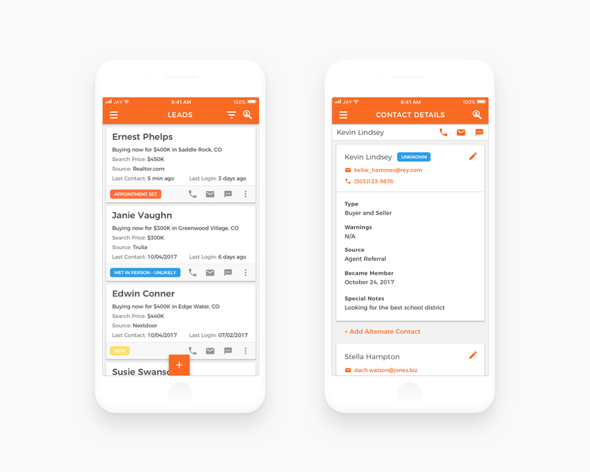
Firepoint customizable dashboard

Customizable Dashboard

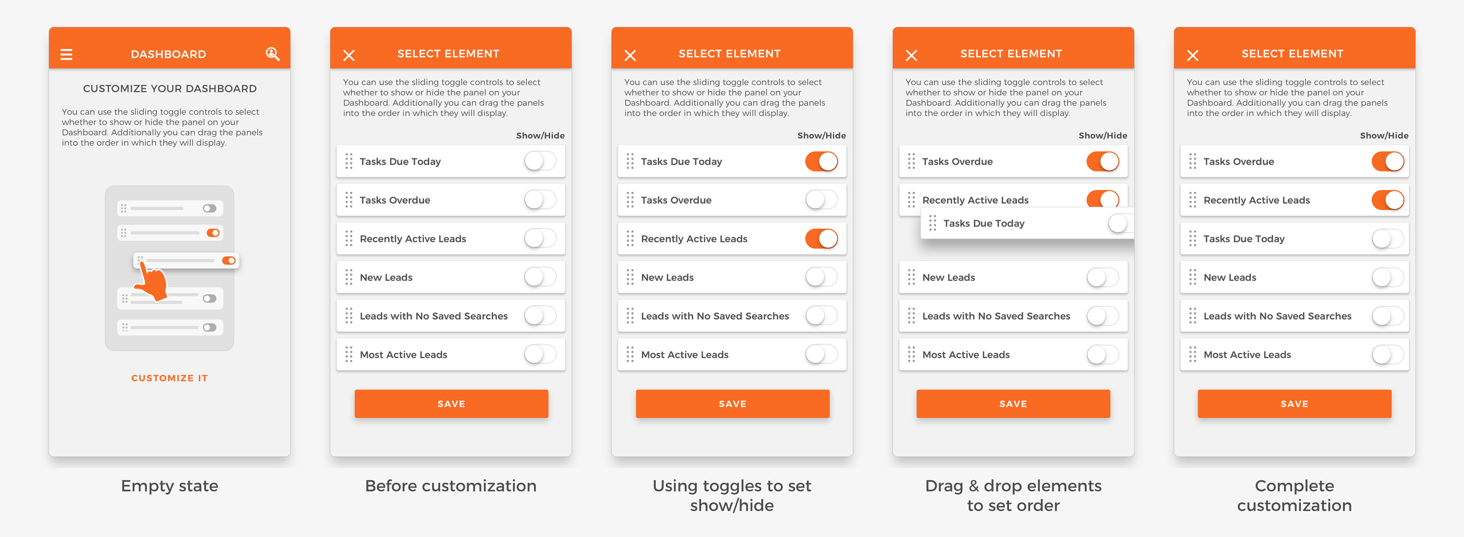
Each real estate agent can set what they want to see when they launch the app according to their preferences. I thought this was one of the most important factors to improve user experience, and I designed the customizable dashboard, where each user can toggle to show or hide certain sets of information and drag & drop to change the order of the information displayed.

Firepoint tasks

Tasks

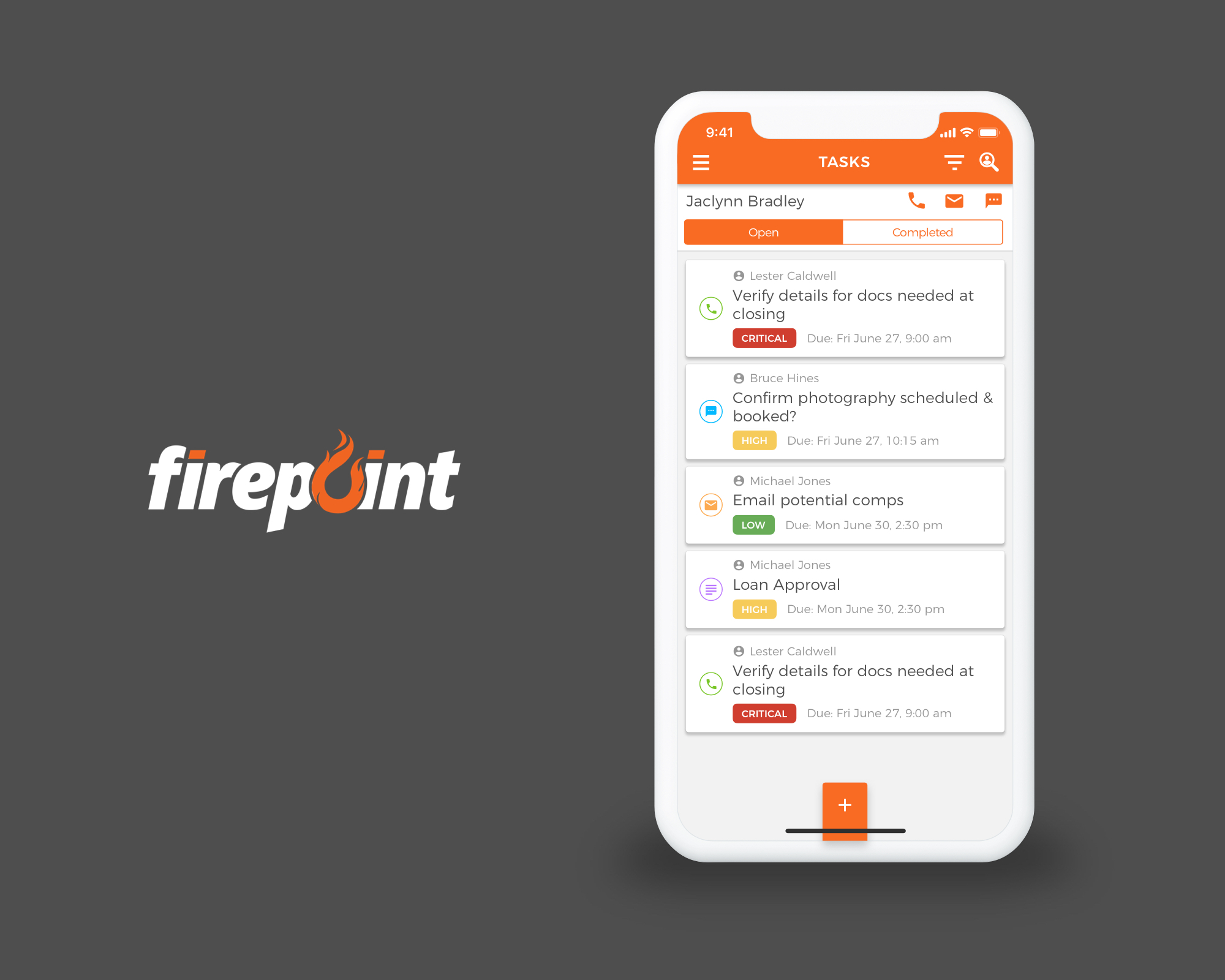
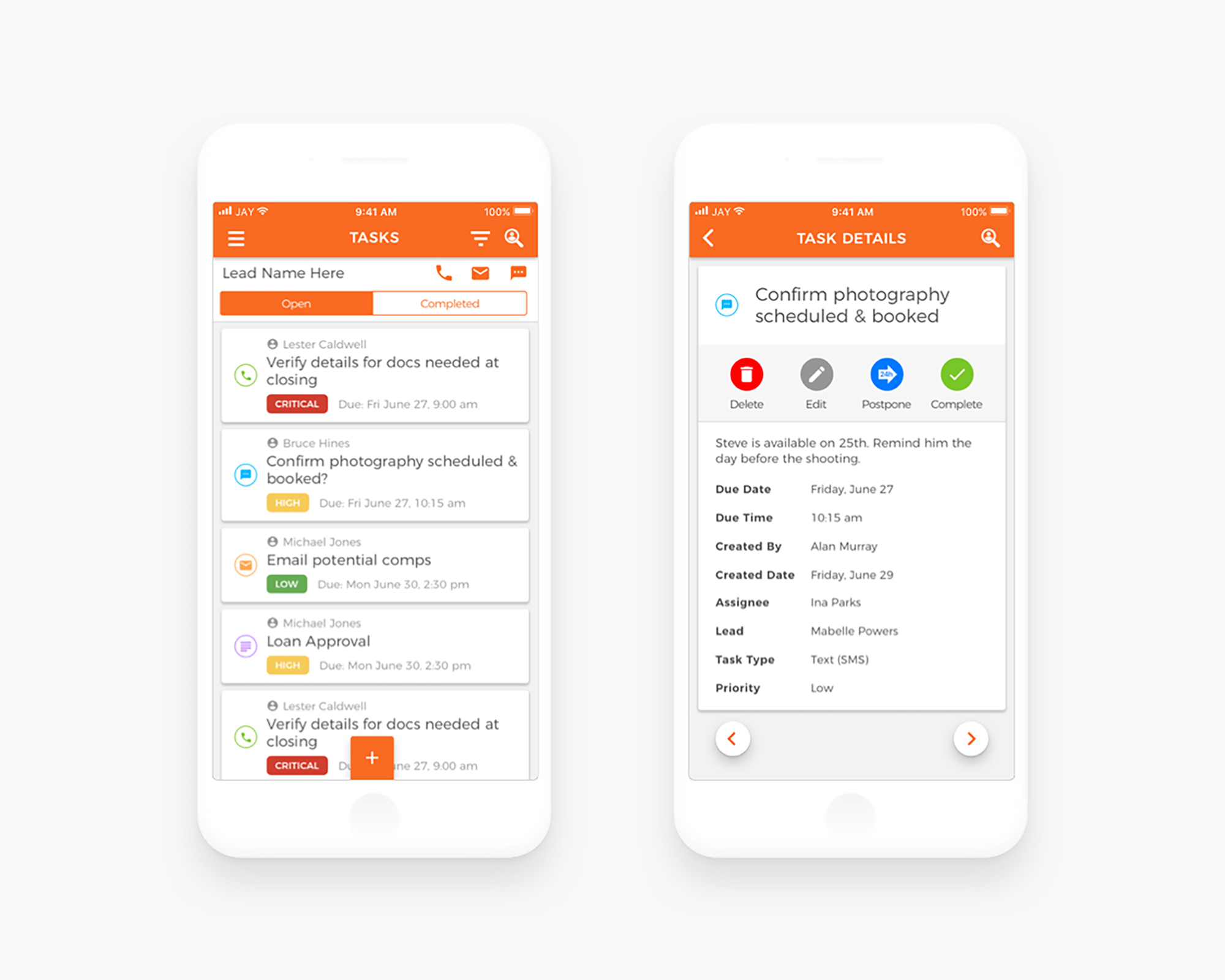
Although, the tasks feature is available on the existing web application, I added a push notification feature to make its functionality more valuable. It helps to agent keep an eye on their customers anytime and anywhere.

Firepoint leads management

Leads Management

Managing leads is the core feature of the app. I strived to create a design in which agents are able to search, view, categorize, and communicate with leads as easily as possible.

Firepoint communication

Communication

The CRM platform that runs in mobile devices brings an amazing synergy.

Outcome

The app is currently live on both the App Store and Google Play. Current web application users can now enjoy a fast and smooth native mobile app experience.

← Work

Helping Habit

Helping Habit aims to be a bridge between volunteers and nonprofits. It allows a nonprofit organization the flexibility to post all of their events on a platform that is easy to use and a way to make direct connections with new and existing volunteers.

Helping Habit

Project Type

iOS mobile app
Web app
Admin portal

Role

Designed the product in two different platforms, an iOS and web.

Skills

Sketch – Wireframe and screen design
InVision – Prototyping and client communication

Helping Habit discover

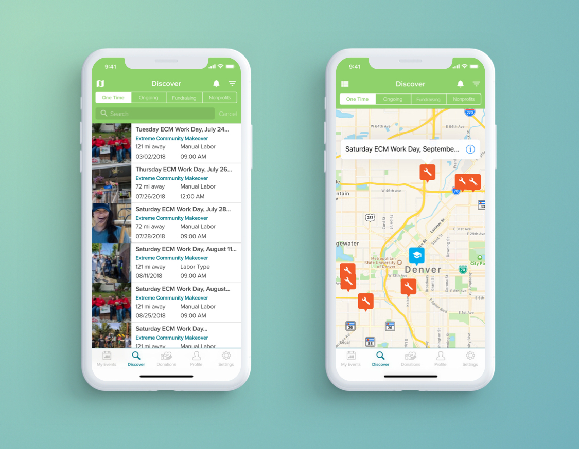
Discover

Users can search, filter and view volunteer events and can switch to mapview.

Helping Habit donations

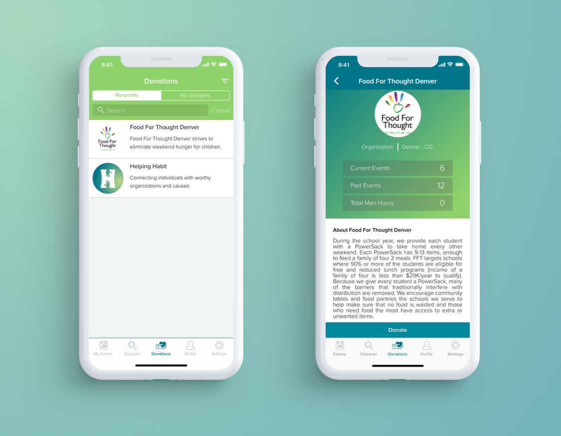
Donations

Users can see all the non-profit organizations that is accepting donations. Users can see the organization’s information and dotate for one-time or set recurring donations.

Outcome

The web and iOS apps are live, please check out the site. Helping Habit

Visual • UX • UI • Product Design

Vision-driven professional with career-long record of digital product design, and management success for leading organizations.

Professional Experience

Deloitte Digital — Senior Product Designer

Denver, CO | May 2019 – Present

  • Responsible for designing digital products focusing on UI in mobile and web platforms.
  • Worked with major tech corporations for the entire year designing multiple products. Presented ideas in a very organized and thoughtful way that gave the client confidence that the suggestions were rooted in deliberate decisions.
  • Designed responsive web components for Adobe Experience Manager. To provide better BX and UX, I have analyzed existing web components and created new web component library that were more cohesive with groups of brands.

AppIt Ventures — Lead UX/UI Designer

Denver, CO | December 2014 – May 2019

  • Mobilize the design team in delivering high-quality projects by managing bandwidth, mentoring junior designers, evaluating individual performances, and delegating projects to the appropriate talents.
  • Cultivate positive relationships with clients by defining their needs, collaborating on products, roadmaps, creating consistent and intuitive product solutions, adhering to the constraints of the product’s technical framework, and maintaining project transparency and client confidentiality.
  • Created interactive mobile/web application mock-ups, prototypes, user-flows, and wireframes in an agile work environment, troubleshooting and resolving issues as necessary.

LYNNEL Art to Form — Graphic Designer

Denver, CO | July 2013 – February 2015

  • Liaised with clients to define digital artwork specifications, providing regular project updates.
  • Designed effective promotional materials such as email campaigns and brochures by HTML/CSS, Mailchimp and Adobe Creative Suites.
  • Conceptualized, shot, edited the marketing video; support customers in understanding the full design process.

Education and Credentials

Bachelor of Fine Arts (B.F.A.)

Digital Design, 2014
University of Colorado, Denver, CO

Associate of Arts (A.A.)

Intermedia Art, 2009
Kaywon School of Art & Design, Seoul, South Korea

Certifications

Adobe Certified Expert

Photoshop CC
April 2016

Proficiencies

Design Proficiencies

  • Prototyping
  • Wireframing
  • Pixel Perfect Design
  • Interaction Design
  • Visual QA
  • Typography
  • Iconography
  • Branding Identity
  • Design System

Software Proficiencies

  • Sketch
  • Figma
  • InVision
  • Principle
  • Zeplin
  • Photoshop
  • Illustrator
  • InDesign
  • Premiere
  • After Effects
  • WordPress
  • HTML/CSS

Interests

  • Breakdancing
  • Golf
  • Fishing
  • Indoor Plants